Jo
Senior Producer
Project Manager
Leadership


The Artist of the Community and for The Community
One of the benefits of running in a few art and design communities is catching glimpses of new tech, plugins, features, and tools. If tool reviews are trending or getting discussed, it's a good indicator that you'll find some good ins and outs and how people use it. Knowledge is funny; we collect it because of its value, but the value increases when shared. Live streams are another way to keep a finger on the pulse of features and trends from companies. You can see that with Figma's Config and Adobe's Max and Live Streams. It's cool to see how companies intend you to use tools, but the real magic is seeing when an individual creator or group of folks push it beyond its original use case. These hacks often lead to approaching both the process of making and the tools themselves differently.
Attending live conferences is another way to hear how people get the most out of their tools. There are several creative conferences: Creative South, Brand New, Crop, Awwwards, South by Southwest, Dribbble, Epicurrence, Story Conference, Circles, ICON, 99U, HOW, and AIGA are ones that come to mind. I always return to working alongside other creatives as my favorite way to learn new tools, tricks, and methods. It's those small shortcuts and workflows people develop and don't think about that excite me. You'll only see them if you're shadowing or looking over someone's shoulder. Communities like Latreo are a great place to start. Several communities and creators have built online hubs to share and teach. They live on platforms like Discord, Twitch, Youtube and Patreon. There is no shortage of places to learn from, and find what works for you.
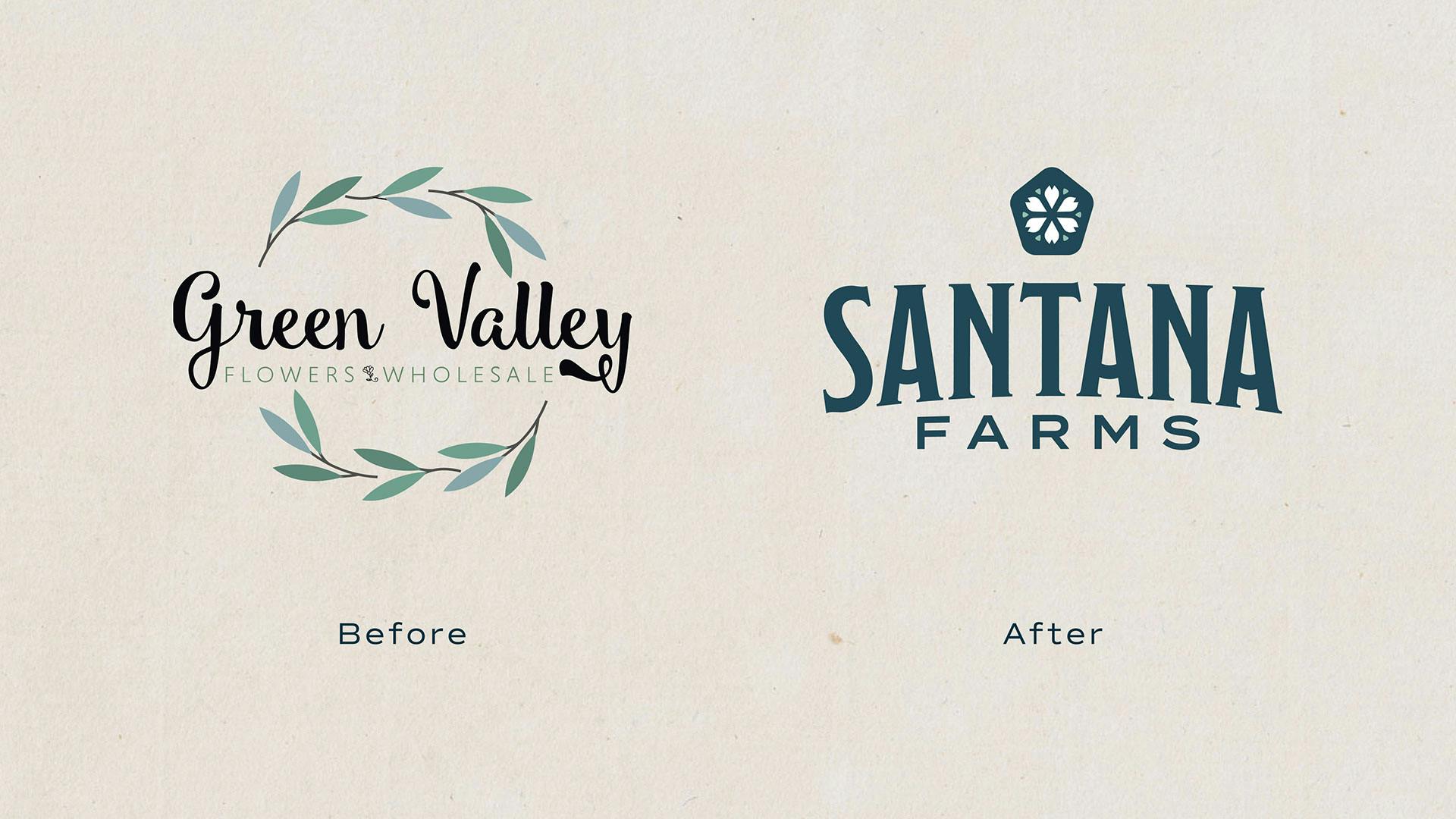
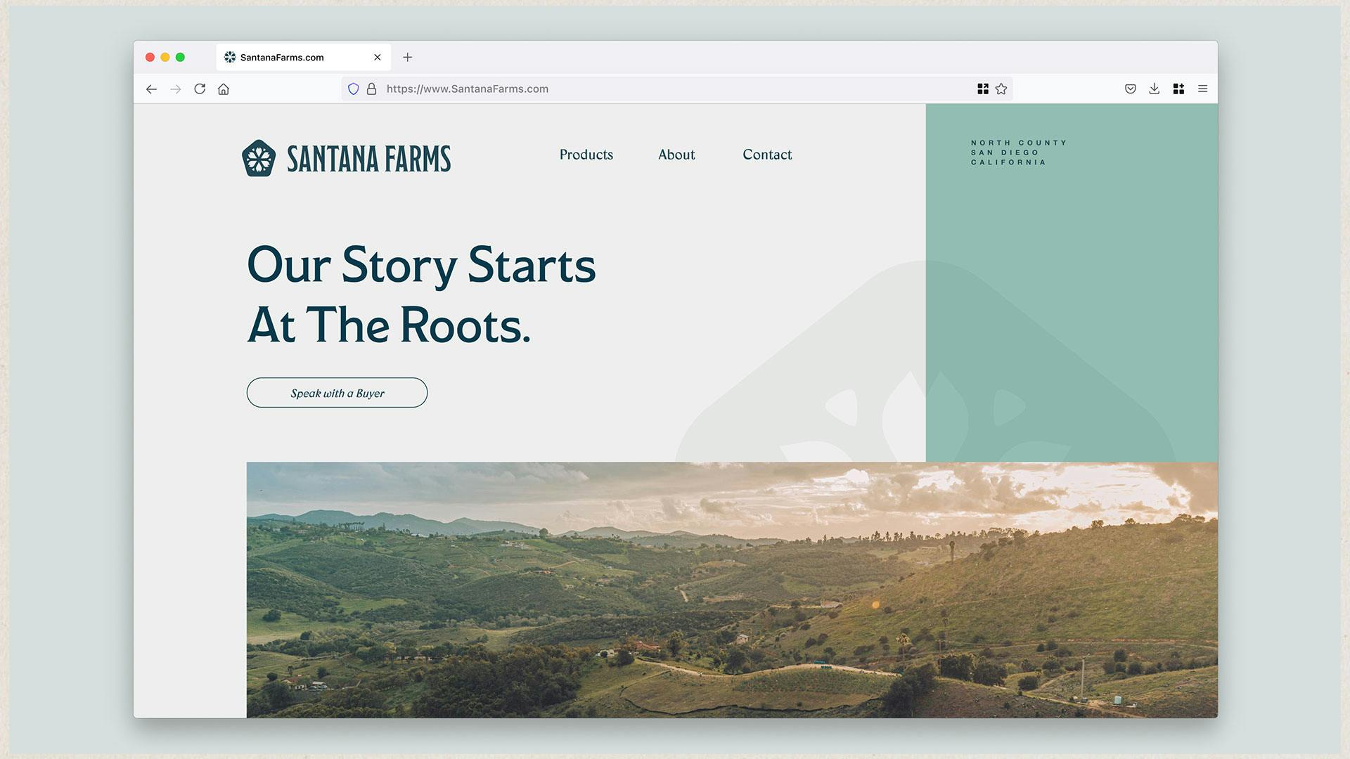
Challenging and rewarding often are two sides of the same coin. New challenges often lead to greater confidence and unique offerings. The rebrand for Santana Farms was one of those recent projects. In this case, the challenge was helping them shift gears from requesting a website to understanding how a name change, rebrand, and marketing would be beneficial. Just because a website exists doesn't mean people know it's there or will stumble in for a peek.
Ultimately, the company was rebranded, visual and verbal languages were crafted, and patterns were built to support the brand. It was a lot for them, but they handled it swimmingly. If I did my job correctly, we built their confidence and guided them through this major shift in the company. It usually is intimidating and scary to make significant changes. We do this work all the time, so we have remember to lean into empathy. Bring clients along, invite them in. You're not dictating design decisions to them. Step outside the jargon and industry knowledge and into their world and words. Remembering this may be the first time through a creative process.
I always have had this desire to understand what I don’t know and I learn by doing more than reading or watching. So, if I see a design technique someone else is doing or on an online course then I am curious to add it to my repertoire.
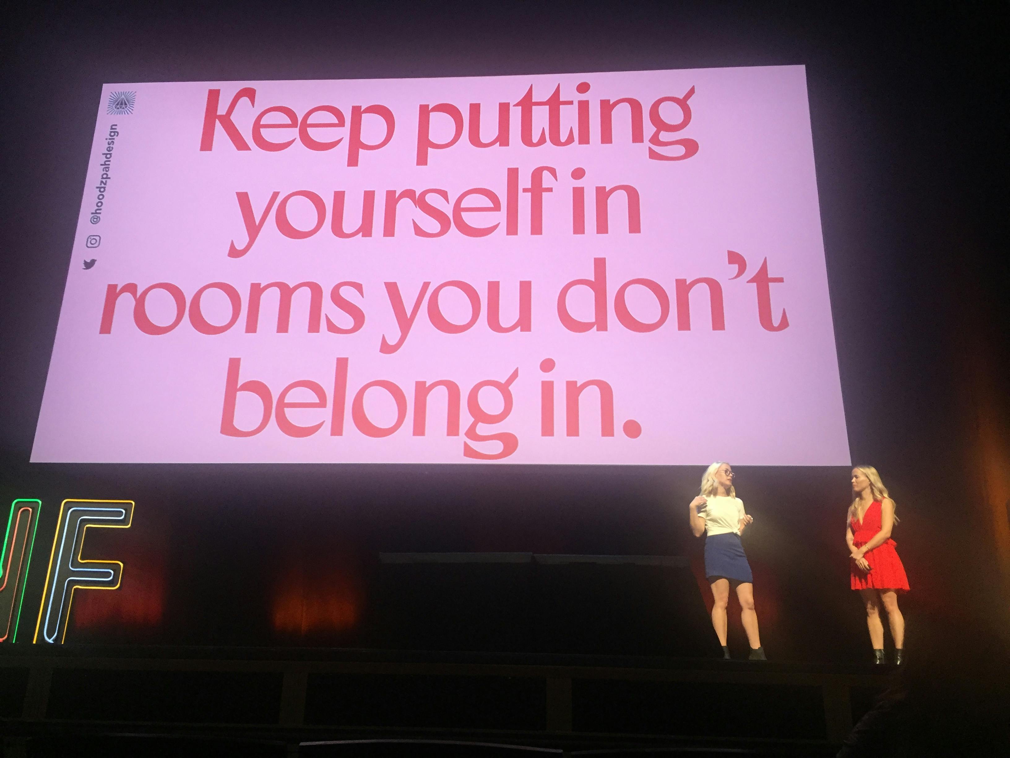
Unfortunately, you don't come out of school fully prepared for much. A great university, excellent professors, and stellar classmates pushed me to excel, but nothing beats real-world working experience. Over the years, I have sought out mentors, joined groups and attended conferences, all to learn how to level up aspects of my thinking and approach to work. One of the best quotes I've heard about evolving your skills was from Amy and Jen Hood of Hoodzpah Design, "Keep putting yourself in rooms you don't belong in." This encouragement reinforced my desire to be in rooms I didn't understand or were "above my pay grade." I wanted to be in those rooms to learn how to ask better questions, to understand what gets lost from the meeting to when the creative brief gets dropped on a designer's desk.
At some point in your career, you realize you're not the new kid on the block. You've been around; you have some street cred. You need to be looking for others to help come up through the ranks. Start teaching and mentoring them. When you can spot and articulate issues and help direct others toward a better solution, skills are strengthened, things will click faster in your work. It's ok to start teaching before you think you're ready. We tend to discount ourselves and what we know. If you're five years out of college, you have five years of experience to share with those graduating. The industry will be better because of this.
I wonder if "to be fully prepared for a role" is a disaster waiting to happen. When we don't prepare or think we can wing it because we've "done this a million times," we open ourselves up to failure, show up as overconfident or apathetic, and potentially underdeliver for our clients. Come into each project prepared to learn something.
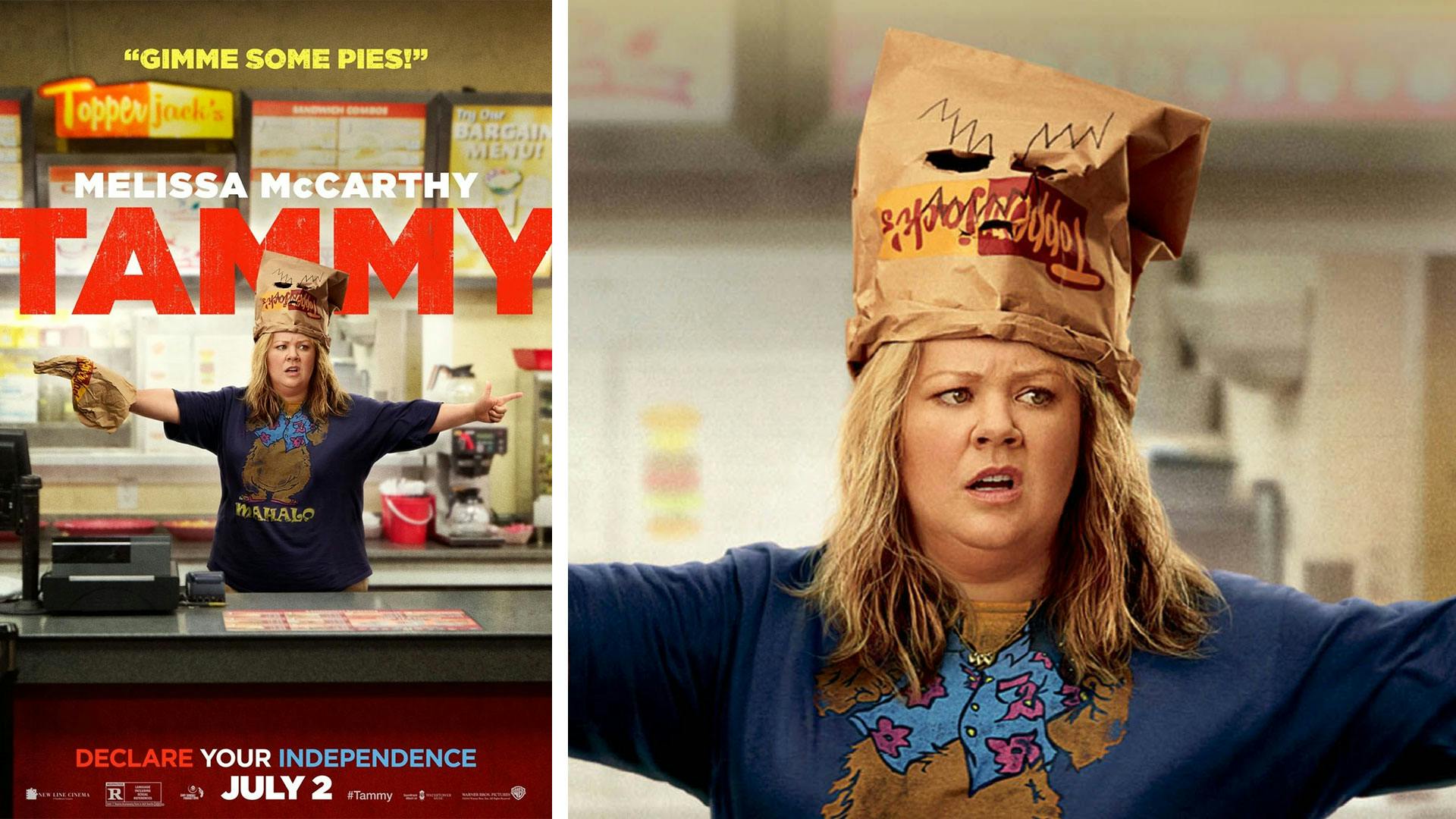
It was a blast. Mainly because seeing my work on the silver screen was not something I was chasing down. However, I did enjoy writing it on the list and checking it off. The work for Screen Gems was for Melissa McCarthy's movie Tammy. I worked with the prop master to produce bags used for the robbery scene. They were custom-built to accommodate McCarthy's head. It was amazing to get that call. It's ok to have some fun, silly work and experiences in your past.
That's the coolest way being old has ever been communicated. There have been a few ways the industry has evolved. They all leave little micro adjustments on how we approach, collaborate, and produce work.
1. Remote work opened up new horizons for everyone.
If you can put a silver lining on a global pandemic, I'd say transitioning to remote work would be it. Remote tools have greatly influenced how we all interact and collaborate. It's opened folks up to work seamlessly with companies in various locations. Time-shifting is done more regularly. Teams spread across time zones can make progress around the clock. We have more tools for virtual collaboration now more than ever. Miro, Figma, ClickUp, Sketch, Around, Whimsical, the Google suite, Microsoft Whiteboard, and Notion are some i've used in the last 12 months over different client engagements.
2. Be more intentional with your meetings.
That freedom to meet virtually with anyone has shifted my thinking on meetings. Tossing a Zoom or teams meeting on the calendar is really easy. Stacking meetings back-to-back was done before remote work but now feels like an assumed standard way of working. Is it OK to do this since we are working from home? No. Sure, we eliminated running from floor to floor to accommodate meeting rooms, but we need to be intentional about our meetings. If the meeting invite/link doesn't have an agenda, I'm ok with declining the invite. It took me a second to warm up to this. Yes, it might be aggressive and harsh. However, once you sit in a few back-to-back meetings about meetings or hear, "So, what's on the docket for this meeting?" you get really protective of your time. Even if it's a casual 1:1 meeting to catch up with a team member, be intentional about providing a few talking points to show you care about them, their time, and their mental health. Giving them breathing room when filling up their calendar. Start a meeting at 10:05. Give folks a chance for a "bio-break" or hydrate.
3. Allow the process to evolve as you learn.
Learning to communicate and talk strategy with clients has increased because of knowledge sharing. Presenting in person allows you to read the room, pause for questions, and clarify confusion before proceeding. When schedules don't align, we have tools like Loom and Zoom that allow us to record presentations. This keeps the client from skipping around in the PDF to uncover the proposal price or zone out during the needed context to understand the design decisions.
4. AI co-Art/Creative Directors are probably not going anywhere.
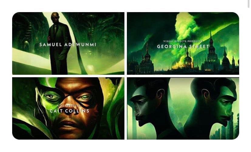
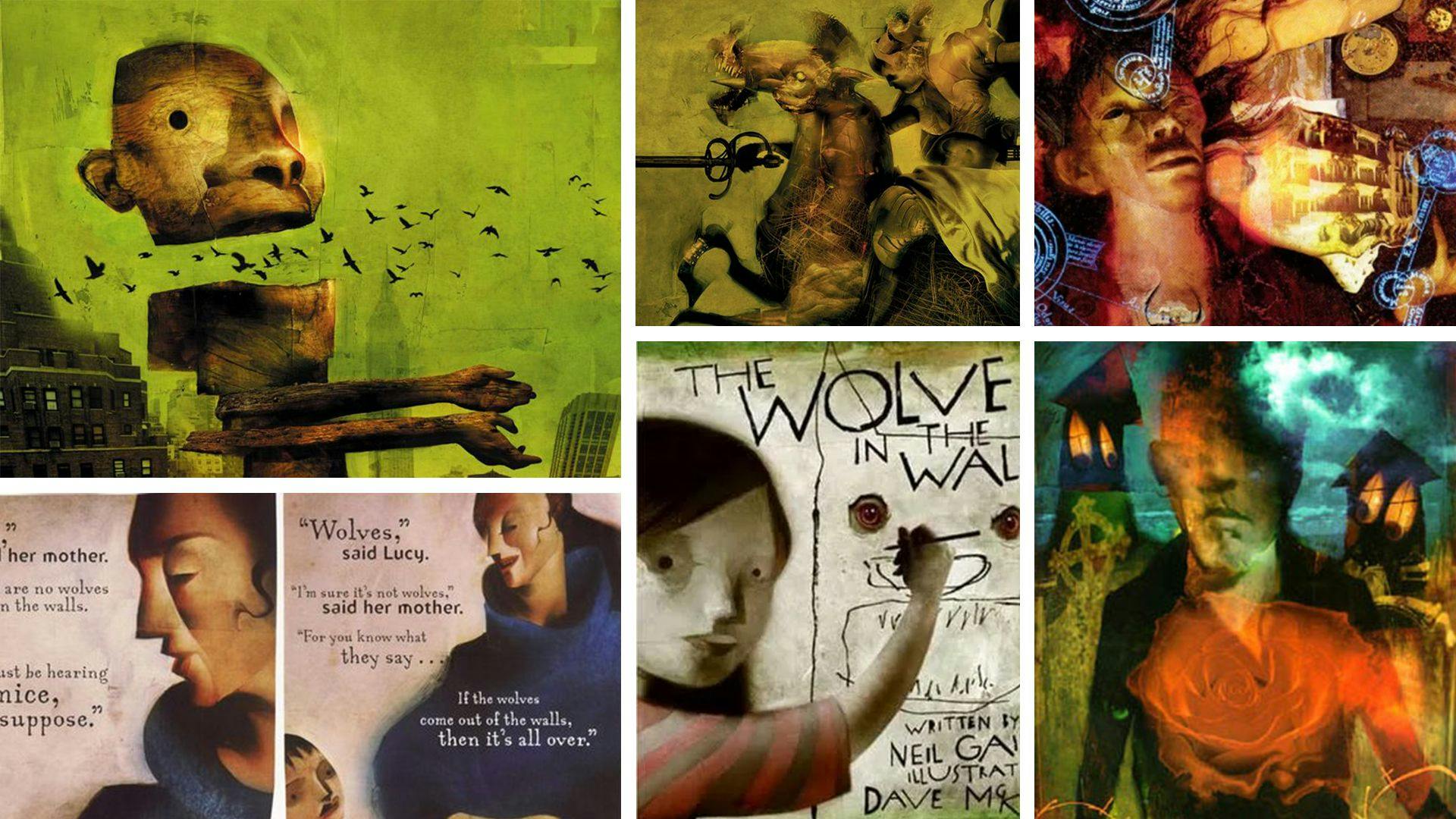
The most recent evolution is the introduction of AI. I'm trying to navigate this myself. I'm on board with automating tasks and helping with efficiencies, but there are some substantial gray areas for me. Generative content like Adobe is sharing has some serious advantages. Take this example of agency work done 20 years ago for a plastic surgery client. I spent two days hunting down stock images and combining 4-5 images to build the ad. All to accommodate the client's request to convert a crew neck t-shirt into a scoop neck. This can now be done in a matter of minutes - to varying degrees of success. Using Bard or ChatGPT to have "conversations" with yourself in a brainstorming session can shake loose some fun things. But I think some serious regulations need to be implemented for this to be adopted. We're seeing implementation on a large scale with Marvel's use of AI in the opening credits of Secret Invasion. It feels like a Dave McKean piece of work, but done erroneously. Again, this one is still evolving.
5. Analog still has value.
So much of work and life is now digital. When you can, make it real. Make physical mockups or packaging. Seeing something printed and mocked never ceases to be an experience. Plus, I always find little corrections that need attention once it's printed. Having physical traces of your work beats jpegs all day long. Stepping away from the computer to make for yourself is an excellent way to let things you've mentally collected manifest. Make more than you consume. It'll help keep you from being creatively constipated.

"Everything you can imagine is real." - Pablo Picasso There is a BBC interview with Orsen Welles where he speaks about the wonder of ignorance and the power of imagination. The part I'm referencing starts at marker 6:28 and runs through 8:00. https://youtu.be/xKra6_NAey8?t=388 It's a reminder to not limit the possibilities; others are completely capable and will step in to scale ideas. Understanding composition, blocking, and camera movements will improve translation when sharing ideas with directors and production crews. It's clear when you have someone who understands how to make things dynamic rather than cut back and forth over the shoulder during dialogue. This video does a fantastic job showcasing Steven Spielberg's decisions about blocking and staging. https://www.youtube.com/watch?v=ItbCLh4Auoo If you haven't seen something, don't assume it can't be done. View it as an invitation to make it happen.
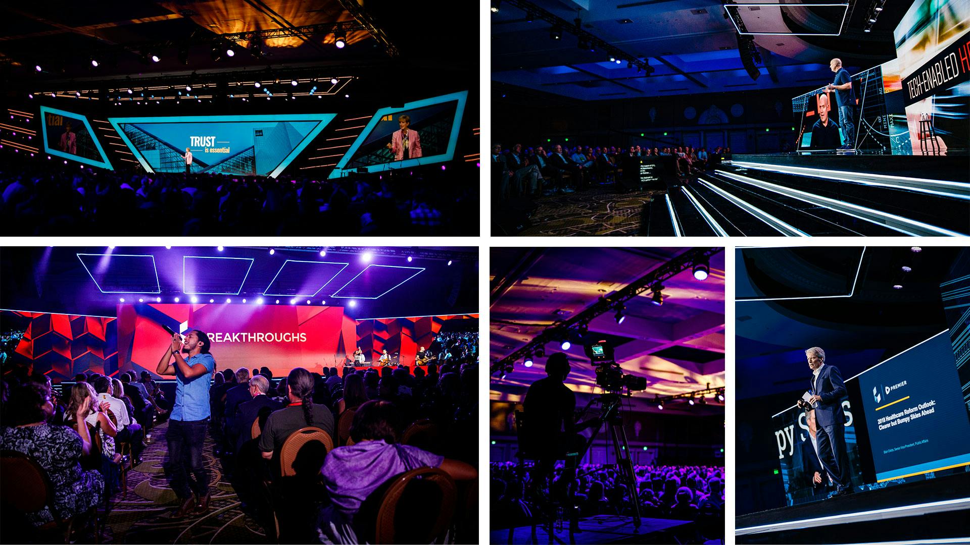
Each project is going to have its own challenge(s). Hopefully, when you encounter one the first time, you take steps to keep it from repeating. My most complex experiences have been designing and executing elements for live events. Developing and designing for these can be your most outstanding work. There are so many elements at play you're bound to learn something every time. The very first large-scale event I worked on was Engadget's inaugural Expand Conference. A few items in scope included vendors, tech showcases, and a main presentation hall signage and screens. Along with stage builds and lighting, there were cameras on cranes, Step-and-Repeat graphics for live broadcasting in breakout sessions. Digital graphics for LED walls and electronic updates. Printed materials were created for wayfinding, banners, layout and print design, and bus wraps. Lots of takeaways from this first conference informed work for events like Atlanta's True Conference and Premier's Breakthrough national healthcare conferences.
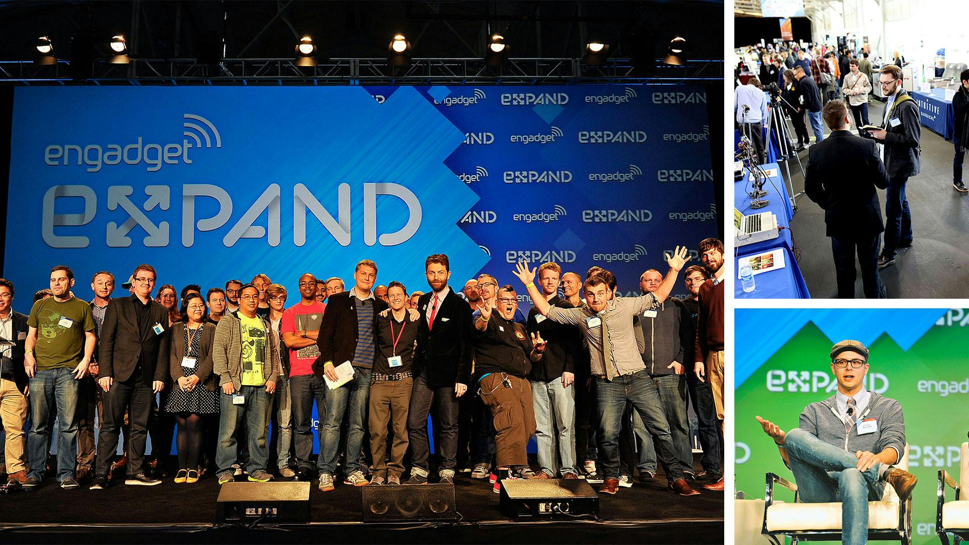
The two biggest challenges of that first conference were working with Union workers and computing power vs. file sizes. I'd never worked with a union crew before. Being told you couldn't do certain set-up items or had to do others due to contract stipulations was a pain point. An oversight that was examined much more closely in future contracts and negotiations. Computing power versus file sizes is an ongoing battle. As our abilities to imagine larger and more elaborate stage production, an equal demand will be placed on the tech used to produce those elements. For example, the pixel map built in 2013 for Engadget was 2304 x 1296px. In 2019, we upped the ante a skosh to 25,920 x 2,716 px across three screens for the Breakthroughs Conference. I saw my share of the "pinwheel of death" during both of these builds.
Flipping through swatch books to find coated and uncoated colors is a good place to start. I did just miss out on the Rubylith era of design in college. The importance of accessibility was nowhere to be seen. Heck, Apple's App Store launched around or before some of the folks I'm honored to work and learn from had gotten their driver's licenses.
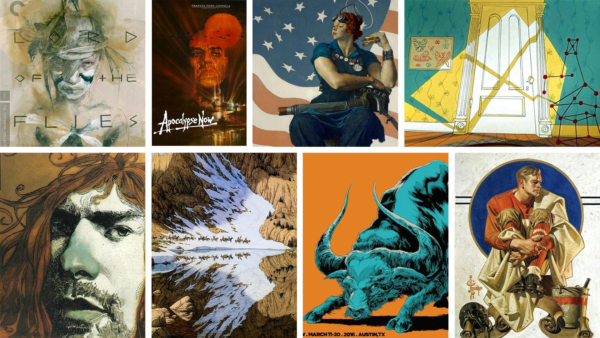
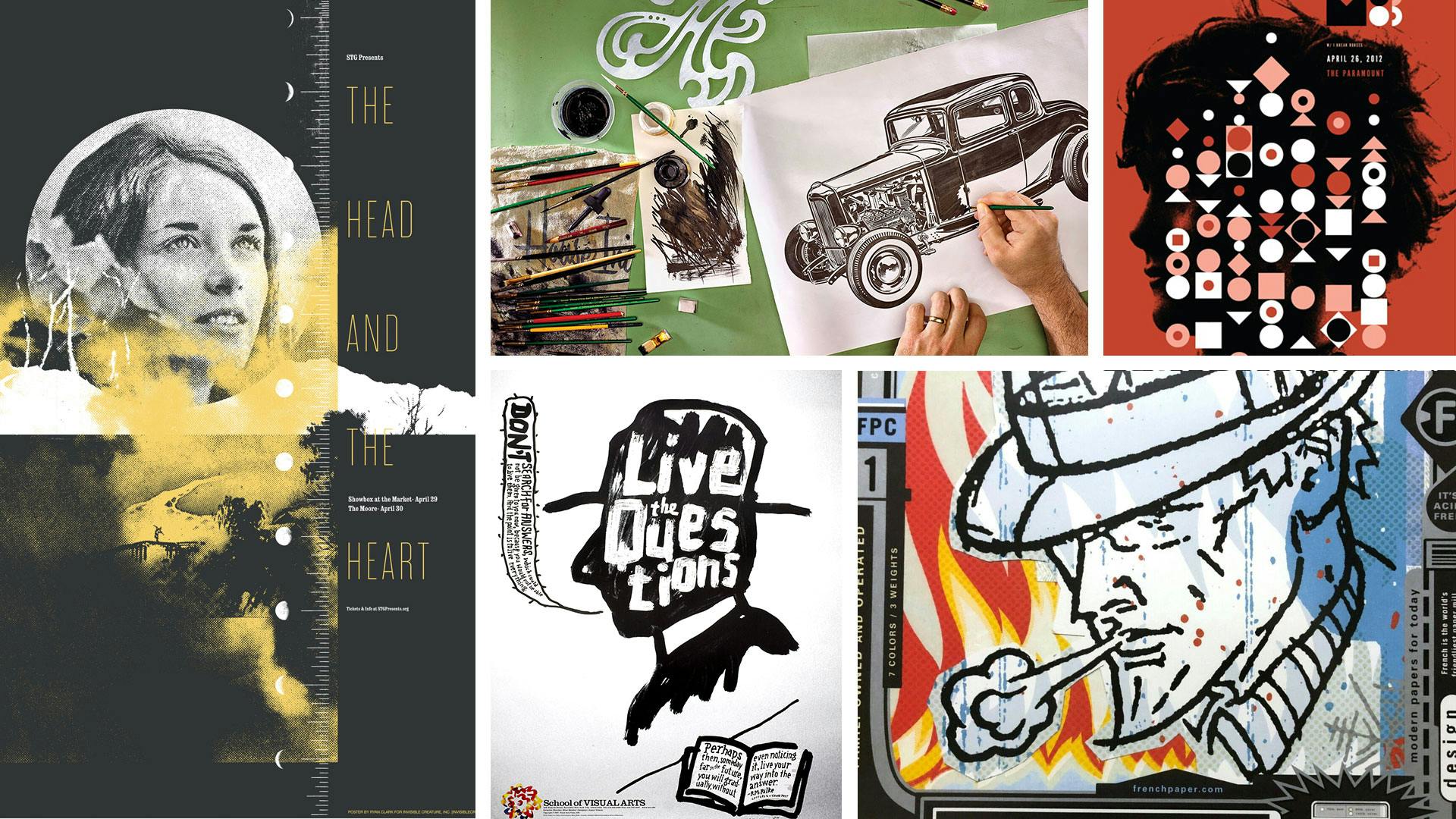
My background leaned hard into traditional design and illustration, often venturing into fine art. I'd say my background is grounded more in the arts than others in product and interaction designers. Which is one of the wonderful things about this industry. People have some wild paths to their careers. My visual heritage combines cartoons, comics, art, design, and illustration. If you were to look at my art/design family tree, you'd see Charles Anderson, House Industries, Asterik Studio/Invisible Creature, and James Victore are my design parents. Bev Doolittle, Sterling Hundley, Ken Taylor, Kent Williams, Chuck Jones, Maurice Noble, Norman Rockwell, and J.C. Leyendecker are my illustrator parents.
The unifying thread between traditional design and interaction design is a love for problem-solving. There is a huge overlap once you start comparing things. The terms are different, but the goals are similar. Doing user testing with app development is much like understanding target audiences when building marketing campaigns or branding. We're evaluating how people will respond to our design decisions.
Being able to have your process locked in but at the same time being able to add and take away things through experimentation of your personal projects is the best.
Do you want to move the needle for your client, or are you simply focused on making a portfolio piece? Understanding business goals and having a target audience are closely related and immensely important. You need to know who the audience is to set goals that pertain to them. If the company has overarching goals, that helps define the target audience. If the client doesn't know or can't articulate their goals or who they think their target audience is, more work must be done before you start.
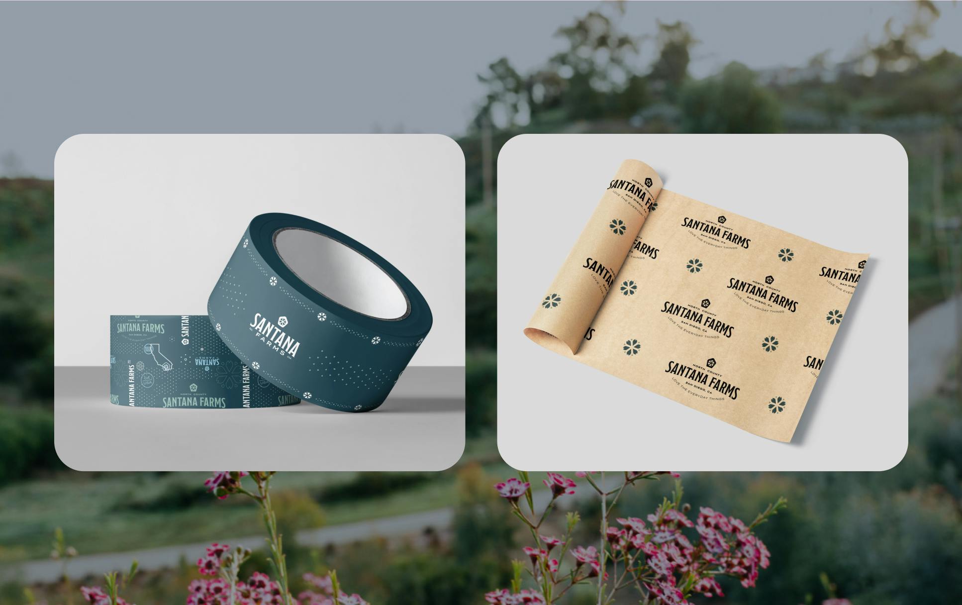
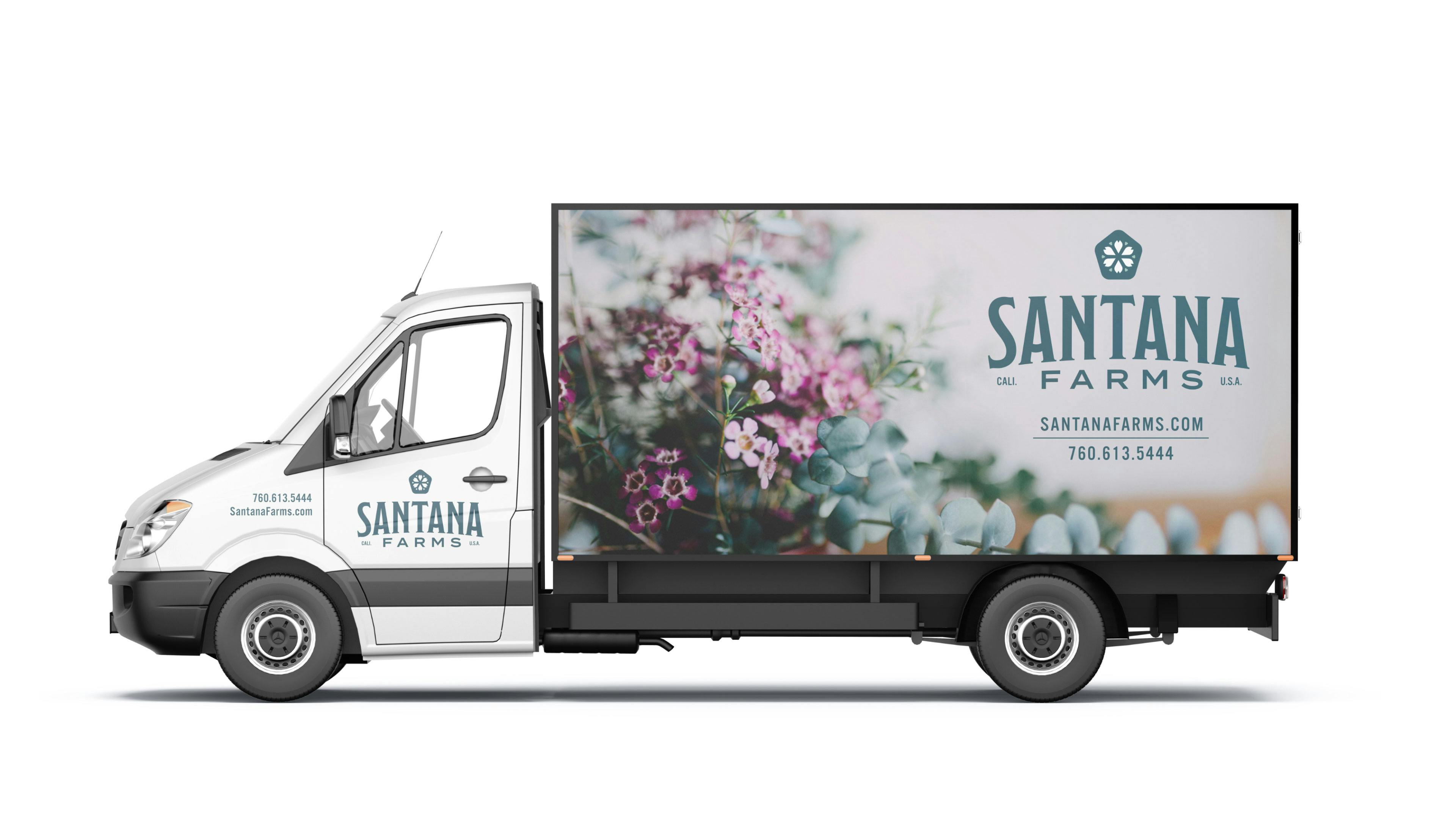
Constraints allow us to better understand the problem we are solving. Let's go back to Santana Farms. During the project's discovery phase, we learned they sell primarily to wholesale accounts. We also learned they wanted to be suppliers for Vegas casinos, interior designers, and a go-to-grower and supplier for future Rose Bowl Parades. We struck an intentional balance between high-end, being accessible, while remaining true to the Santana Farm company roots. What are elements that would help them stand out when shipments arrived? How could packaging speak to that higher-end customer? Custom packing paper, hang tags, branded delivery vehicles all have a purpose that point back to the goals and audience.
Having a target audience is like having a compass on the open sea. It keeps the project from wandering off course by trends or new tech. It also helps clients defend decisions during conversations with their staff, patrons or even with that inevitable family member that "doesn't like X."
