Ben_Tripp
Art Director

When I first started out with my degree in visual communication, the industry was a pretty different place from what it is now. "Website design" was an optional module at university that I took out of interest - I can't imagine that not being a key part of the design curriculum now! However, the core foundation and principles of the field remain the same - though it's certainly important to take the time to stay up to date with what's happening in the industry and not get stuck on any particular space or tool as the field is constantly evolving, and so should designers.

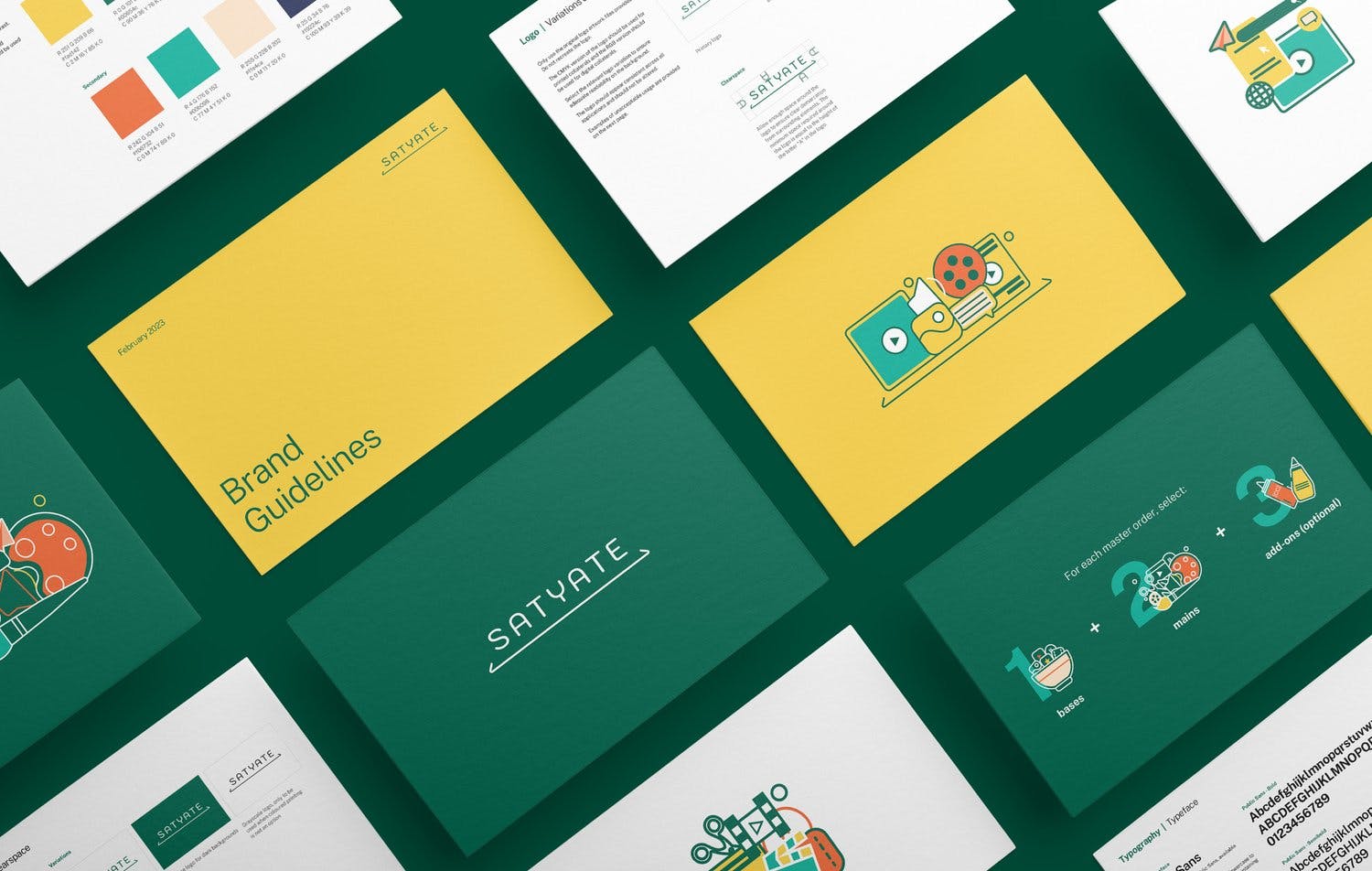
Creating a brand is about finding the delicate balance between creating a cohesive system that will create a unified brand identity; while not being too restrictive and not leaving any room for creativity. It's important to nail down key details, whether typography, colour palette or imagery style; but I would caution against being too restrictive beyond the basics as ultimately designers need some room for flexibility to create something interesting and memorable. Overly complicated brand guidelines also tend to get lost in translation when being implemented in the real world. There's no one-size-fits-all answer here, but I think these are the main things to keep in mind when creating a new brand language.

When working with an established brand, the brand guidelines create the basis on which we develop materials, and this determines most of the end of the result. However it is for us to put a unique spin on how we can implement those guidelines in a way that is cohesive with the brand, but not being repetitive or boring. It's important to understand the ethos of the brand as well as the target audience that you are designing for, and then make design choices accordingly.
After completing my BFA in Visual Communication, I began my career in an agency, where I gained invaluable experience working on diverse projects with multidisciplinary teams. After a few years, transitioning to an in-house graphic design role allowed me to deepen my understanding of marketing and art direction while leading brand initiatives across the Asia-Pacific region. This experience inspired my entrepreneurial spirit, leading to the creation of Studio Giraffe in 2018. By founding my own studio, I embraced the opportunity to channel my creativity into a venture driven by my vision and passion for design. Six years on, the studio continues to evolve, taking on new types of work and cultivating strong client partnerships.

Be open to new ideas, and always make the time to learn. Whether through courses, reading up online, talking to other designers or even going to your local museum, inspiration is everywhere and it's important to take the time out to find it.

I think I'd go with Hawkeye - precision and a keen eye for detail!
My career has been largely focused on working with corporate clients, so this is something that I learnt with experience. It takes practice to learn how to take on a piece of work and infuse it with your ideas and vision while staying true to the business itself, and not leaning too much into your own "style".

Communication is key! Asking loads of questions, understanding as much as I can about their business and audience. Trying to get on the same page before coming up with a first draft is important; and then the vision can be fine-tuned through a few rounds of feedback.