ckomashko
Graphic Designer
Illustrator
Industrial designer
3D
Art Director
Fine Artist
Creative Director
Photographer
Video
Audio
Typeface Designer
Director


Since the inception of my practice, my work has undergone a profound transformation, evolving in both technical expertise and creative vision. Initially, I was focused on aesthetics and execution, but as I gained experience, my design approach became more strategic. Now, every decision I make is driven by a clear purpose. In the realm of UI/UX, I have transitioned from crafting visually appealing interfaces to designing functional, user-centric experiences that tackle real-world challenges. My projects involving online dispute resolution and stock market transcription have pushed me to fine-tune critical aspects such as information hierarchy, accessibility, and seamless interactions.
My journey in branding has taken me from simply creating logos to developing comprehensive brand identities. I now regard typography, color schemes, packaging, print production, and digital presence as interconnected elements that work harmoniously together. My collaborations with Manam Chocolate, Bugbase, and Red Labs exemplify this holistic approach.
Moreover, I have honed my ability to deliver designs that are not only visually striking but also highly functional across diverse mediums—be it event posters, business cards, or digital UI screens. Ultimately, my work has evolved from merely enhancing visual appeal to significantly improving user experience, adding value for users, businesses, and brands.
I balance artistic expression with technical precision by treating design as a science and an art form. Creativity drives my concepts, but precision ensures they function effectively in real-world applications. Whether working on UI/UX projects, branding, or AI-driven tools, I start by defining explicit constraints—usability, accessibility, and technical feasibility—while leaving room for creative exploration. This structured approach allows for innovation without compromising functionality.
In UI/UX design, I blend aesthetics with user-centered logic. A minimalistic interface isn’t just about clean visuals; it’s about guiding users seamlessly through an experience. Every colour choice, typography decision, and layout element serves a dual purpose—enhancing form and function. Similarly, when working on branding, I ensure that artistic elements like logo design and typography align with the brand’s core identity, making them visually engaging while scalable and adaptable across different mediums.
Ultimately, my process is about finding harmony between creativity and logic. Artistic expression adds uniqueness and emotional impact, while technical precision ensures reliability and usability. By weaving both together, I create visually compelling work that effectively solves real-world problems.
Being based in India has deeply influenced my work as a graphic designer. The rich blend of cultural heritage, diverse aesthetics, and rapidly evolving design trends in India has shaped my ability to create deeply rooted in authenticity and adaptable to contemporary global standards. For instance, the vibrant colours and intricate patterns of Indian textiles often find their way into my designs, adding a unique cultural touch to my work.
My work in India has provided me with a profound understanding of regional storytelling through design. Whether it's branding for Bhu, where I integrated traditional calligraphy to reflect heritage, or designing for Manam, where I reinforced my ability to create premium yet approachable branding, I've always strived to strike a balance between aesthetics and real-world functionality, ensuring that my designs exude exclusivity and high quality.
Furthermore, the Indian market's growing appreciation for premium, homegrown brands has influenced my approach to typography and layout. I've leaned towards clean, elegant typography that reflects sophistication while avoiding generic luxury cues. The dynamism of India's creative industry has pushed me to be adaptable. Design here isn't just about aesthetics; it's about storytelling, accessibility, and problem-solving for an incredibly diverse audience. Whether working on branding, digital interfaces, or AI-driven tools, I've learned to create designs that resonate across cultures, fostering an emotional connection and engagement while remaining visually compelling and functionally precise.
My approach to design is deeply rooted in understanding the essence of a client's brand. This understanding allows me to balance my style with their vision, subtly integrating my design sensibilities. It's not about imposing my style on a project but using it as a guiding framework to enhance the client’s identity in an authentic and refined way.
My design approach is not rigid but relatively flexible and adaptive. I start by deeply understanding the client’s goals, target audience, and brand personality. Once I have that foundation, I bring in my style—minimalism, strong typography, and a focus on clarity—to shape the design direction. For example, I ensured the branding felt premium and personal with Manam while maintaining an understated elegance. My natural inclination toward clean design helped elevate the brand’s sophistication without losing its handcrafted essence. Flexibility is key. Some projects require me to push boundaries, while others demand subtle refinements. The challenge is knowing when to dial up creativity and when to exercise restraint. With Bhu, I expanded the brand universe with vibrant elements while keeping the core typography simple.
Ultimately, my style is a tool rather than a limitation. It helps me bring coherence, attention to detail, and a sense of balance to every project, but the client’s unique identity always shapes the outcome. I aim to ensure my designs don’t just look good—they work for the brand and its audience.
I work closely with clients to ensure their vision is accurately represented by focusing on collaboration, clarity, and adaptability throughout the design process. This adaptability reassures clients that their evolving needs and preferences will be accommodated, instilling confidence in the final design. I aim to translate their ideas into a visually compelling and functional design while maintaining a cohesive aesthetic that aligns with their brand identity.
The process starts with deep research and conversation. I take time to understand their goals, audience, and brand personality, asking targeted questions to uncover what they want and why they want it. This helps bridge the gap between abstract ideas and tangible design solutions. Once I have a clear direction, I create concept iterations to give the client multiple perspectives on their vision. I encourage feedback at every stage, ensuring their input shapes the final design. I refine the work if adjustments are needed while maintaining consistency and design integrity. For instance, while working on Bhu’s visual identity, expanding the colour family and typography styles was a collaborative effort to ensure it felt vibrant yet aligned with the brand’s organic essence.
Transparency is a principle and a practice I uphold throughout the process. I involve clients through regular updates, visual previews, and open discussions. This level of transparency ensures that clients are always informed and involved, fostering a sense of trust and collaboration. If there’s a creative difference, I explain my design choices with logic and industry insights, ensuring that any final decisions are made with aesthetic appeal and functional effectiveness in mind.
Ultimately, my role is not just to execute a vision but to enhance it—making sure the final design not only meets their expectations but also resonates with their audience and stands the test of time. To achieve this, I conduct user testing and gather feedback to ensure the design is visually appealing but also functional and user-friendly.
One of my most notable projects, Manam, was a branding exercise to create a premium yet personal identity for an artisanal chocolate brand. The challenge was balancing sophistication with warmth, ensuring the brand felt refined without losing its handcrafted essence. This delicate balance, achieved through my design skills, reinforced my ability to merge aesthetics with functionality, creating a timeless and distinctive identity.
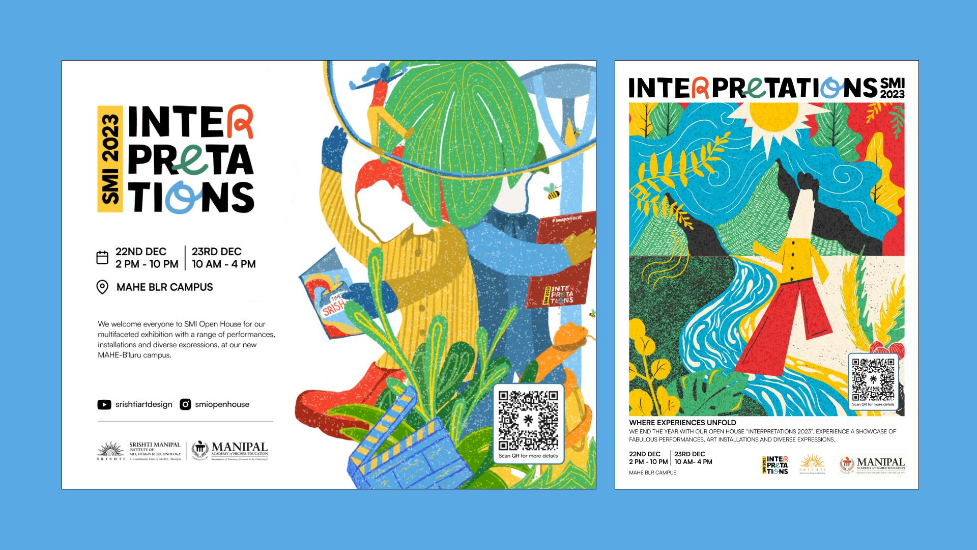
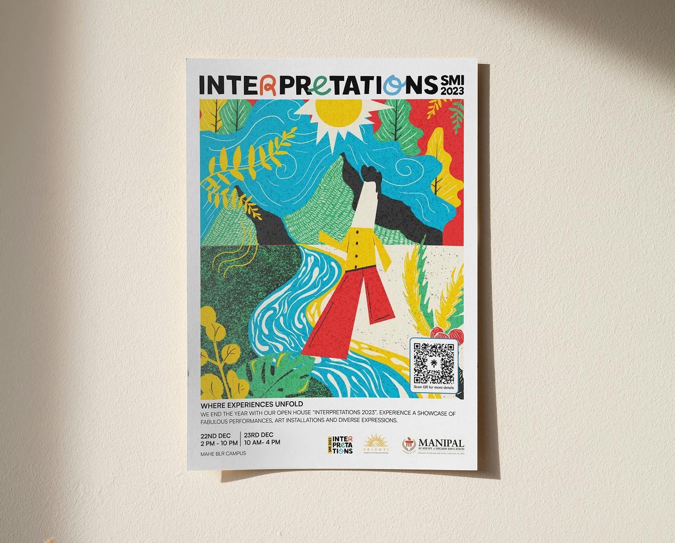
Another transformative project was Interpretations '23, a festival at Srishti that redefined how the college approached events. Traditionally, college fests at Srishti followed an open-ended creative format, but Interpretations '23 introduced a structured yet experimental design language that unified the visual experience. The fest set a new precedent by establishing a cohesive identity across installations, event branding, and digital assets, significantly influencing how Srishti students and faculty perceive event branding. The impact went beyond aesthetics—it shaped how future events at the college approached storytelling and audience engagement.
Working on Vibes Magazine for Rediffusion was an opportunity to bridge the gap between a legacy advertising agency and the Gen Z audience. With over 70 years of history, Rediffusion needed a fresh, youthful approach to remain relevant. I helped redefine the magazine’s visual tone, making it more dynamic and engaging while staying true to the agency’s storied past. The project modernized Rediffusion’s outreach, making it more accessible to a younger creative audience while preserving its industry authority.
These projects pushed me to think beyond design—considering audience perception, storytelling, and brand longevity. Whether shaping a brand’s identity, redefining event aesthetics, or modernizing a legacy institution, my work has always focused on creating meaningful, lasting impact.
One of the most challenging projects I worked on was Interpretations '23, the annual fest at Srishti. Unlike previous years, where the event branding was often loosely structured, this edition needed a cohesive and immersive visual identity that could unify multiple creative disciplines while maintaining the experimental spirit of the college. The challenge was not just designing a brand identity but creating an experience that resonated with a diverse audience of designers, artists, and faculty members.
The biggest hurdle was navigating conflicting creative visions. Since Srishti thrives on artistic freedom, finding a design language that felt structured yet fluid was a complex process. However, by introducing innovative solutions, I managed to ensure that the branding remained adaptable to various mediums—from large-scale installations to digital promotions—without losing its core aesthetic. This required constant iteration, balancing experimental visual storytelling with functional clarity.
Another challenge was execution. With limited time and resources, we had to work within constraints while ensuring high-quality output. Coordinating with multiple teams, managing production logistics, and adapting the design for different applications—such as stage backdrops, event posters, and interactive experiences—pushed my ability to think on my feet. The festival's branding ultimately set a new standard for Srishti, influencing how future fests approached visual storytelling and enhancing the college's reputation. Similarly, the new identity for Rediffusion's Vibes Magazine helped reposition the organization, making it more relevant in a rapidly evolving creative landscape.
Beyond Interpretations '23, another demanding project was Vibes Magazine for Rediffusion. Rediffusion, with its 70-year history in advertising, needed a fresh identity that could connect with a younger audience while preserving its legacy. The challenge was striking a balance—ensuring the magazine felt bold and modern without alienating long-time industry professionals. This required a deep understanding of how Gen Z consumes media, leading to a visual overhaul that incorporated dynamic layouts, experimental typography, and a more engaging content flow. The result helped reposition Rediffusion's outreach, making it more relevant in a rapidly evolving creative landscape.
Both projects tested my adaptability, problem-solving, and ability to balance structure with creative freedom. They were significant milestones in my professional growth, ultimately shaping how I approach large-scale branding challenges.
My UX and interaction design journey began in 2019 when the field still emerged. Structured learning and industry awareness were not as prevalent as they are today. Much of my early work was driven by self-learning, experimentation, and direct problem-solving rather than following predefined design systems or frameworks. I had to pull insights from multiple disciplines—graphic design, psychology, and even front-end development—to find the proper guidance, as there was no clear-cut UX roadmap.
Today’s designers have access to a wealth of well-documented design systems, UI kits, and no-code tools that make prototyping and iteration significantly faster. While this allows for more streamlined workflows, it also means that newer designers sometimes lean too heavily on existing templates rather than deeply questioning design decisions. In contrast, my early work required more hands-on exploration—whether it was custom-building UI components, manually testing interactions, or even hacking together solutions to understand how users behave in real-world scenarios.
Collaboration has also changed drastically. Early on, working with developers often meant bridging a significant knowledge gap, as UX was still finding its footing in product teams. There were no established design-to-development handoff tools like Figma’s Dev Mode or Zeplin, so ensuring pixel-perfect execution required constant back-and-forth communication. Now, designers and developers speak a more unified language, making collaboration more fluid, though it also means there’s a stronger expectation for designers to understand the technical side of implementation.
Ultimately, the most significant difference is mindset. My early projects forced me to think beyond aesthetics—I had to deeply understand usability without relying on external frameworks to guide me. While today’s designers have more tools, the challenge is ensuring they don’t become overly dependent on them. Instead, they should strive to develop a strong foundation in critical thinking, user behaviour, and problem-solving, balancing tool usage and independent thought.
Target audience research is crucial when creating a brand identity because it ensures that the design resonates with the right people, communicates effectively, and builds a lasting connection. Every brand has a unique audience with specific expectations, and understanding them deeply allows for informed design decisions that go beyond aesthetics.
For Bhu, a brand rooted in natural products like honey and oils, the challenge was to create an identity that felt authentic, organic, and premium. The target audience included health-conscious consumers looking for trustworthy, ethically sourced products. Research showed that these buyers resonated with minimalist packaging and earthy, traditional elements that conveyed purity and heritage. This insight led to a calligraphic approach in the typography, which added a personal touch, along with a carefully curated color palette that felt natural yet vibrant in digital spaces. The result was a brand that not only balanced modern appeal with cultural depth but also stood out in an oversaturated wellness market, inspiring the potential of targeted design decisions.
For Interpretations '23, the audience was entirely different—design students and faculty at Srishti who thrive on experimentation and creative disruption. Traditional event branding wouldn’t have worked here. Instead, research into past festivals and student engagement helped shape a flexible, dynamic visual system that felt less like a rigid identity and more like a playground for artistic expression. The branding used unconventional layouts, interactive elements, and a modular design approach that adapted seamlessly across installations, posters, and digital assets, impressing with its flexibility. By aligning with the creative instincts of its audience, the event branding set a new precedent for how fests at Srishti were designed.
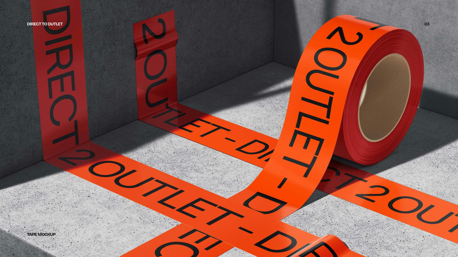
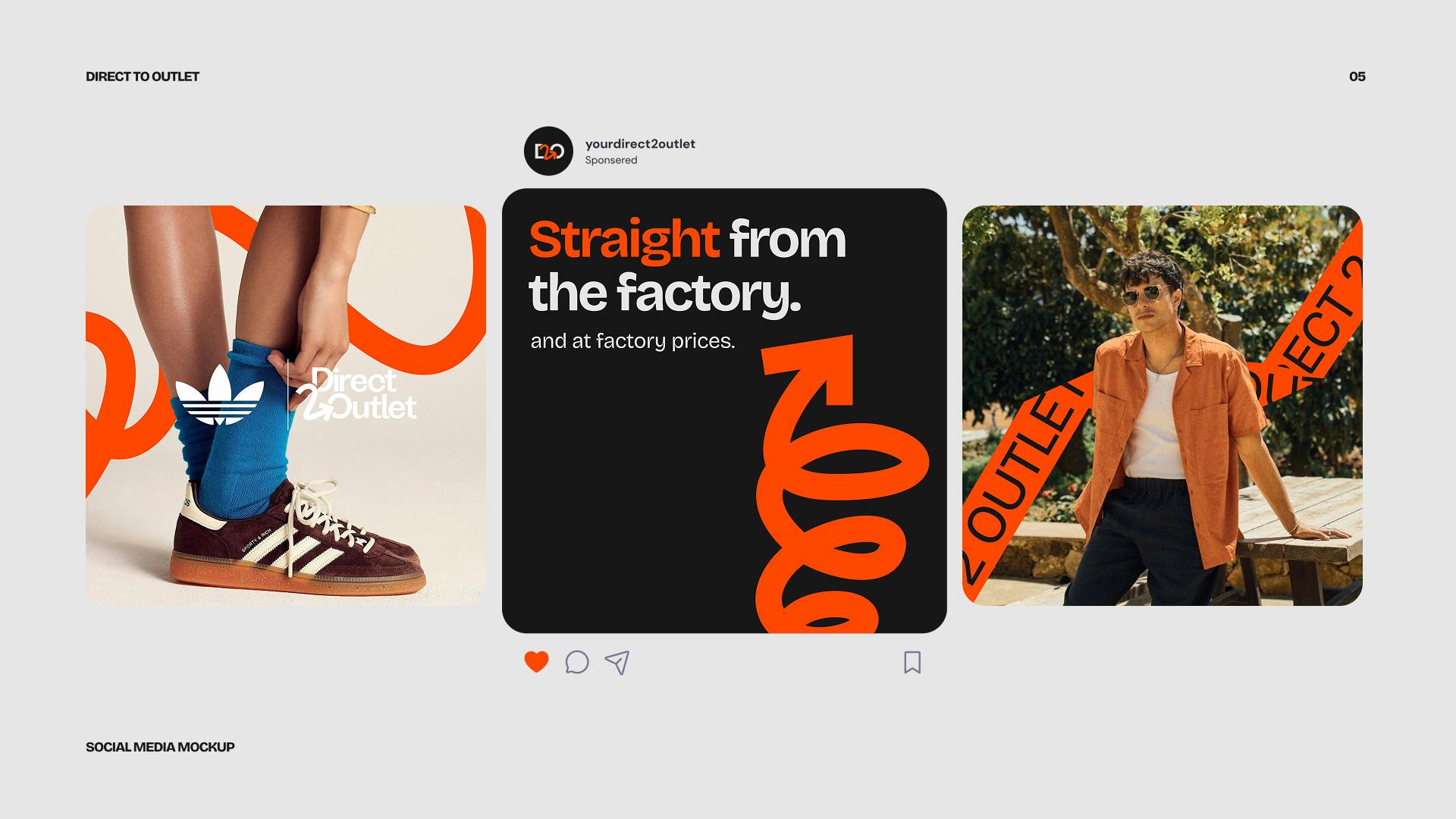
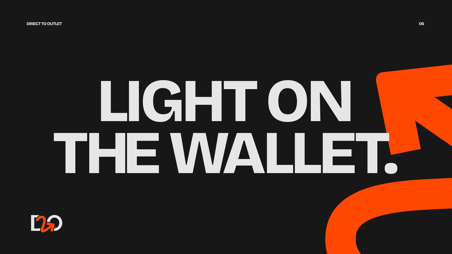
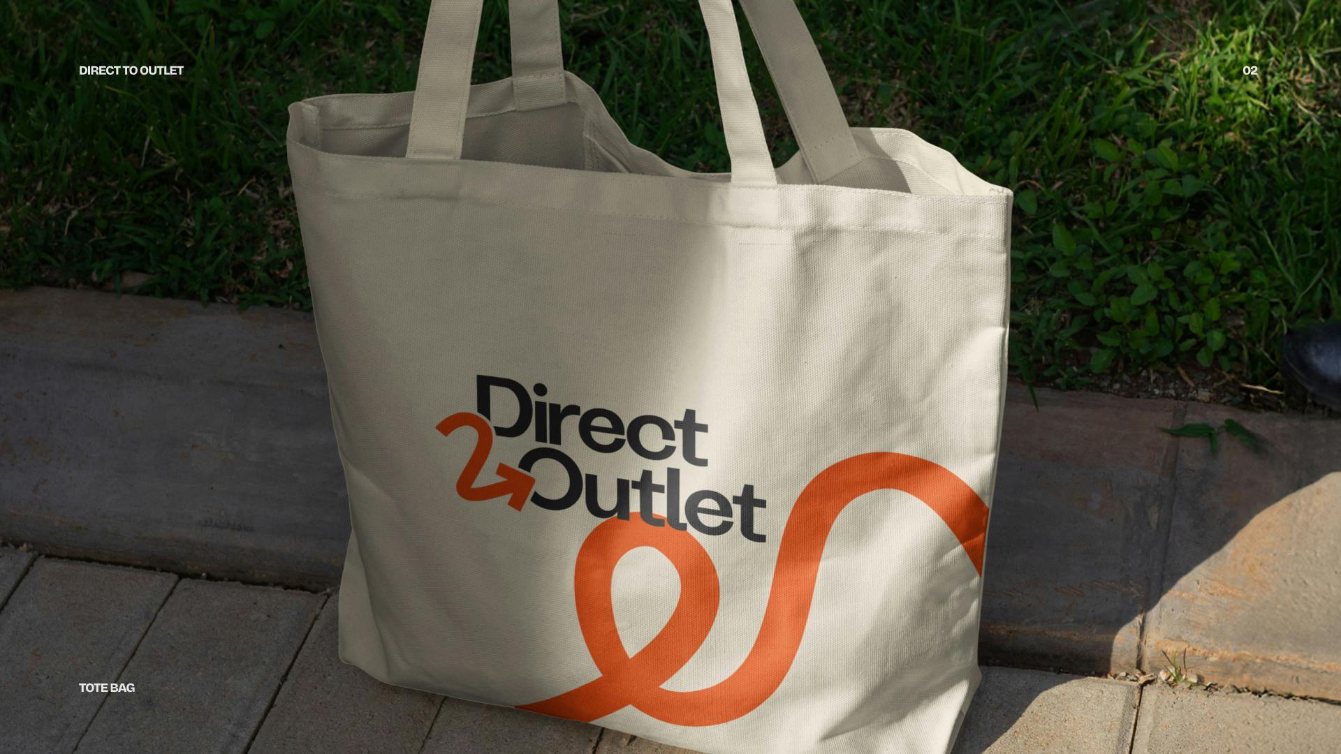
With Direct2Outlet, a platform connecting manufacturers directly to consumers, the audience was more utility-driven—people looking for reliable, cost-effective purchasing options without middlemen. Research revealed that trust and clarity were major factors in purchasing decisions, so the brand identity prioritized clean typography, a straightforward UI, and a no-frills approach to communication. This ensured that the branding felt approachable, professional, and built immediate credibility, reassuring the audience of the brand's professionalism.