Ryan Whiteley
Concept Artist
Illustrator


Always Asking the Right Questions
Kelsie Ryon: I got my start in the design industry as a graphic designer who attended a 4-year university to receive a Bachelor of Fine Arts. My education gave me the best possible base for design (at the time) but lacked much of the digital elements sought after today. I had a professor who encouraged and mentored me after college—teaching me to push the envelope and go after the career I wanted; so, I did.
I left my hometown and moved across the country to a city I had only visited when I interviewed and got a job offer. This move set off my career like a firecracker, opening me up to a market that had no limits; encouraging designers who were hungry and different, and, eventually, enabling me to begin freelancing and honing my digital skills.
Throughout my career, I’ve prided myself in working with small businesses and non-profits and have also been awarded several accolades (including the Silver Addy Award, and Digital Innovation Award as a team). Eventually, this hunger for design led me to projects like a Grand Central Station takeover, where thousands of people saw my work every day, thus helping a mental health advocate spread the word about resources and supporting those in need.
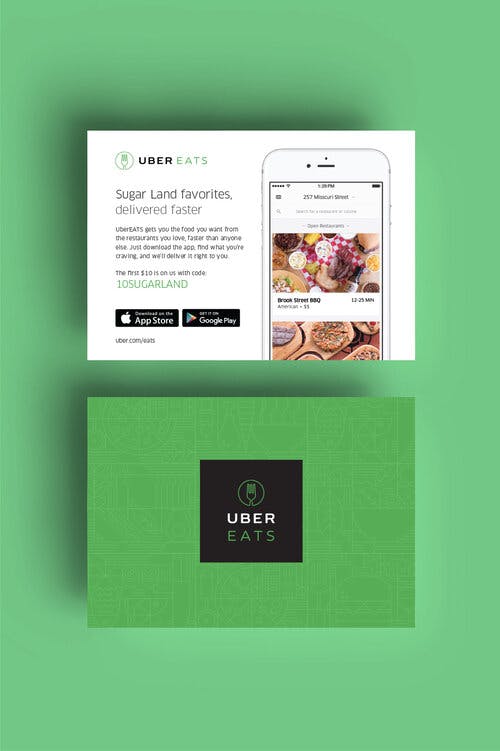
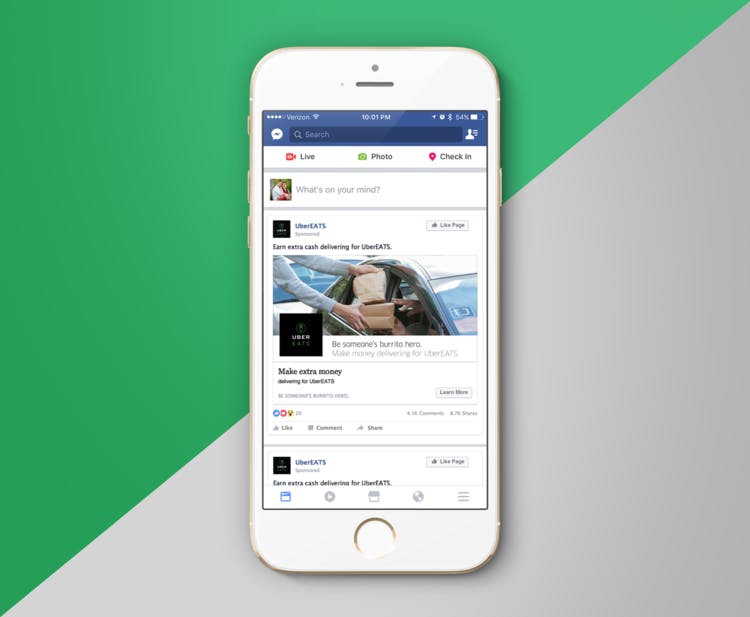
Kelsie Ryon: UberEATS was my first project at dipping my toes into the digital ad space. I was fortunate enough to have an agency needing a contractor for this opportunity and it allowed me to take a peek under the hood of targeted and location-specific advertising, thereby learning about unique areas that respond to different tactics.
Regarding Nike, I worked for an agency that held Nike as a client—which allowed me to work more in retail installation design and rapid 3D prototyping. On several occasions, I was able to visit their headquarters and their test studio onsite to see my retail graphics and installations in person. A very humbling experience.
Kelsie: One of my favorite projects is the Scatter Joy project. This website was just an idea from the clients’ attempt at building on their own. They had needs for functionality but the simplicity, keeping the creative focused around emphasizing resources and support. By bringing in a developer to help make these designs come to life, I was able to facilitate and build a beautiful website with the beautiful purpose to remove the stigma of Mental Health issues.
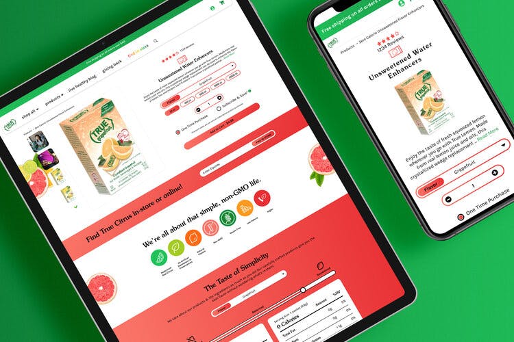
Another favorite of mine is also the True Citrus website redesign—which sees thousands of customers per day. The unique ask was, “How can we fix flawed, dated experiences that hinder the customers’ ability to purchase (the key tenet of a good e-commerce website), without having to re-think the whole structure of the website?” So, I set off a nearly 10-month exercise of masking and re-designing the styling of the website to be more customized.
What came about was a minimalistic yet engaging mega menu style navigation, product-specific brands, and colorways to tell unique brand stories to customers who felt we were personally communicating how the products could serve their lives. The final result had massive strides of increased traffic and purchases while being supported by heat map testing, targeted A/B test marketing, and more.
“Overall, my process starts with extensive questioning.”

Kelsie: The Scatter Joy Project has made huge impacts on the Mental Health community in Ohio and is quickly spreading to other states and even other countries. My website re-design and rebuild on this project enabled the sharing of that information more accessible to those in need, potentially changing someone’s life of struggle to one backed with support and empathy.
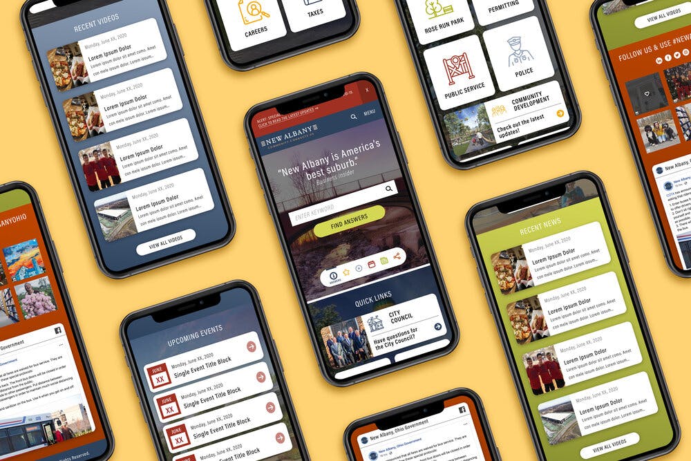
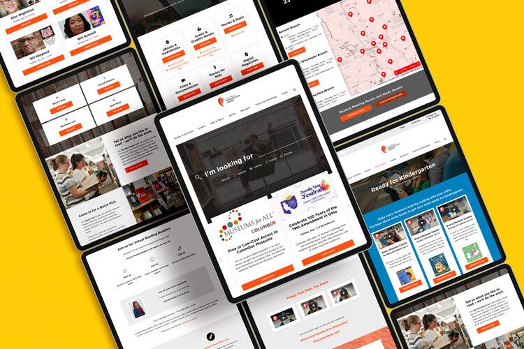
The Columbus Metropolitan Library, meanwhile, is one of my longest, largest projects that took place over nearly 2 years of exploration, testing, and iteration. However, its impact on the community in the midst of State-wide shutdowns and a pandemic was felt in waves—the biggest tenet of the project was providing users with the ability to access library offerings without having to be there in person, so they would be safe.

Kelsie Ryon: I no longer do much web development, but I do keep up with trends using resources like Dribbble, Behance, Awwwards, and more. I also seamlessly communicate with our web, Android, and iOS developers in my current role—who are more than willing to explain to me how something functions and what parameters it functions under.
I find that design in the UX area and development go hand in hand because, if you design a beautiful product that isn’t possible in the existing framework, you’ve missed the mark of usability, feasibility, and scalability—potentially even causing frequent returns to design to course-correct where you went wrong. As a designer, I also professionally mentor other emerging talent entering the UX industry and look to those students for inspiration and as a reminder that growth and learning never sleep.

Kelsie Ryon: Overall, my process starts with extensive questioning. Questions like, “What are the goals? What are the parameters? What do you hate? And what do you love? Have you seen anything that spoke to you? What has been done already? What are your wishlist items for this project? How much time is in the schedule? When should this be aimed to be launched? What are things that could hold up the launch? Who is this demographic we are marketing to?”
