
Nigel Lopez-McBean
Strategist
Leadership
Creative Director
Project Manager
Executive
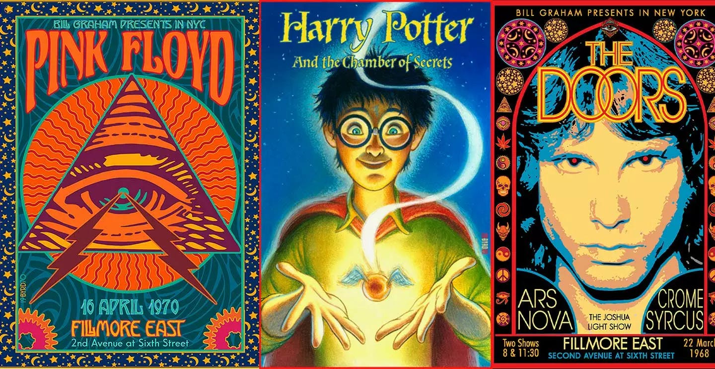
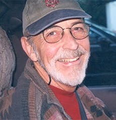
With a career that spans over half a decade during the art, music, and technological revolution, David Edward Byrd has developed iconic posters and illustrations associated with the best of the rock and theatre era.
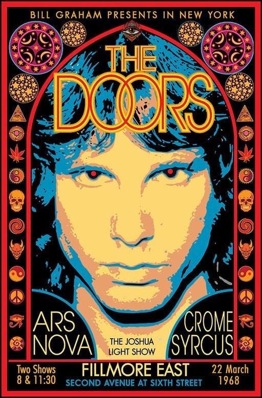
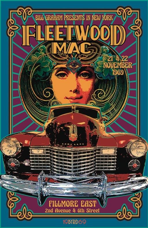
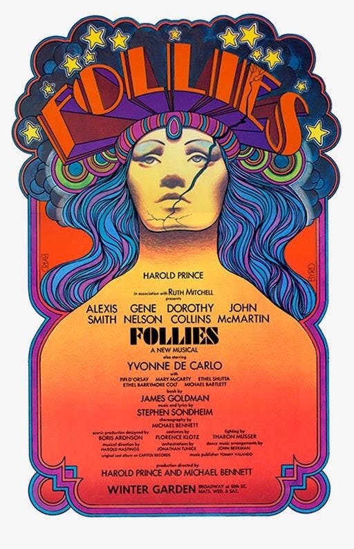
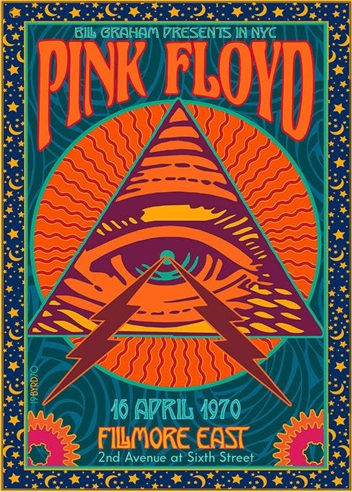
David: I was the poster artist for the Fillmore East in NYC from its opening on 8 March 1968 to 27 June 1971 when it closed for good. At this same time, I was also creating posters for the Broadway Theatre (“Follies”, “Godspell”, etc.). As Rock Posters have a much higher profile than Theatre Cards, I chose that area to illustrate. Also, Theatre is about THIS play right NOW, while 60s Rock is about 60s Rock in general.
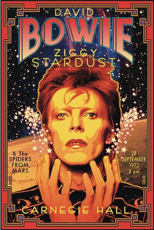
David: The rock poster artist EMEK is a great example of the younger generation’s expertise in the art form (see “Coachella”). Whereas, David Singer is an example of the “Old Garde” moving on to create new imagery (see “Moon Alice”). I still create more East Coast imagery, I think –.
David: Before coming to Manhattan in 1967 I had worked as a freelance Architectural Draughtsman, so I was familiar with the tools of that trade, and thus I decided to apply this craft to the 1968 Jimi Hendrix Experience poster. I created Jimi’s & his band-mates hair using a hexagonal grid with small circles on the grid representing cosmogenic pixels that one might perceive after ingesting certain popular chemicals of the time (see “Acid”). Each small circle was drafted with a drop-bow compass on the center point of the hexagonal grid.
A laborious process, but worth the time . . .
David: Absolutely — an entire sexual revolution has occurred over the last 50+ years. Ironically, the nude female in the center of the poster was copied from the 1847 painting “La Source” by Jean Dominique Ingres, which seemed a perfect symbol for a poster representing “An Aquarian Exposition” (the “Water Bearer”).
But the Wallkill City Council thought otherwise (exposed breasts & pudenda a no-no). I had a similar experience with the NY Times treatment of my “Tommy at the Metropolitan Opera” full-page ad in the Sunday Times, which featured a nude Tommy rising into Pinball Heaven — the Times editor chose to paint a crude Black Marker Jockstrap over his very modest genitalia, alas.
David: Manhattan & San Francisco are light-years apart both culturally & artistically. The West Coast artists created Psychedelia and Neo-Nouveau and are due to the many encomiums they have received for this. David Singer and I were friends and we traded posters. David created the most Fillmore West posters (60 total) of any artist on the planet. For me, his posters are the Apex of the West Coast work. Victor Moscoso influenced my design sense with his vibrant close-value posters (see “Sopwith Camel”) and continues to do so today.
David: In 1991, I took the position of Senior Illustrator at Warner Bros. Creative Services, which I held till 2002 • Besides creating illustrations, backgrounds, and style guides for all the Looney Tunes & Hannah-Barbera characters, I got to create commemorative plates for The Franklin Mint, souvenir posters for the Batman series of films, style guides for feature films such as Space Jam, The Wizard of Oz, and television shows such as Friends, The Cartoon Network and Scooby-Doo.
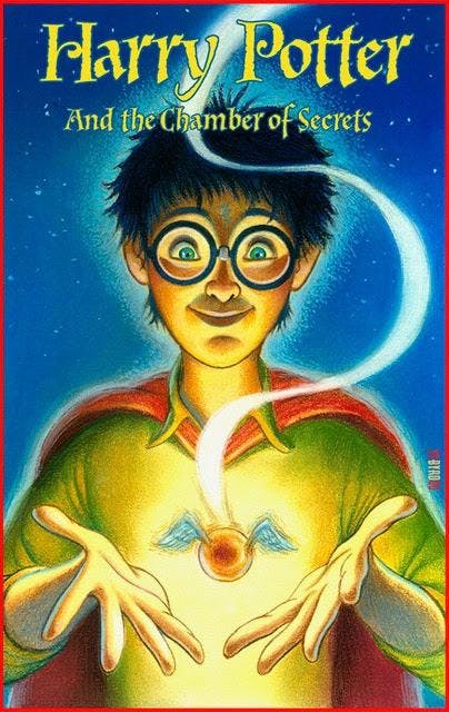
My department was responsible for the Bugs Bunny Postage Stamp, the first cartoon character on a U.S. Postage Stamp. I created special signed pieces for The WB Studio Stores Galleries based on The Masterpiece Series style guide art that I painted in 1999. I also did a great deal of work on the style guides for two of the Harry Potter films: Harry Potter & The Chamber of Secrets and Harry Potter & the Prisoner of Azkaban.
One rarely sees the Graphic Collections of major museums on display, so being part of a museum collection as a poster artist does not put one on the creative map, so to speak. But it is a nice thing to tell one’s sweetheart.
David: As I have often said if I had remained a painter I probably would not be in any Museum at all. But this is not for me to know. One rarely sees the Graphic Collections of major museums on display, so being part of a museum collection as a poster artist does not put one on the creative map, so to speak. But it is a nice thing to tell one’s sweetheart . . .
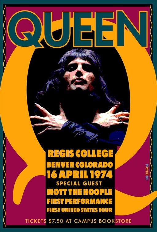
David: My art chops improved immensely in the last 20 years. I hope it is somewhat evident. My work was hit-or-miss in the beginning but things have gotten better of late.
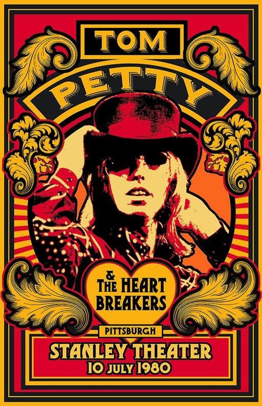
David:
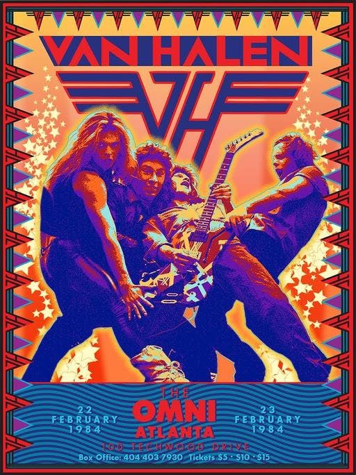
David:
1.) Collect References & inspiration in the Folder.
2.) Create rough pencils for scanning.
3.) Collect possible Fonts.
4.) Build rough designs on Mac
5.) Choose 1 main color and build up from that
6.) Proof printing
David: ADOBE SUITE (PhShop; Illustrator; InDesign) + Typestyle
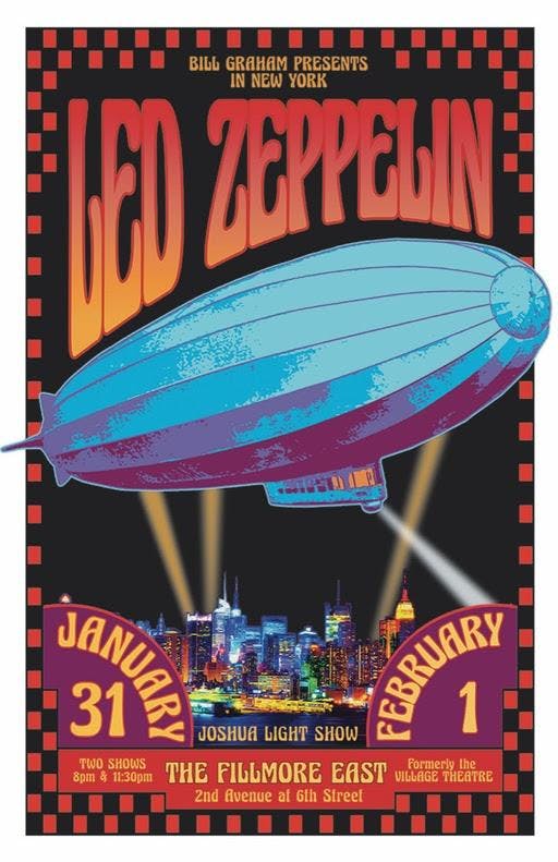
David: Eye-Fun • Immediacy • Gotcha • Who-Is-This-Guy? • Wowie-Zowie