Mike Thoang
Graphic Designer
Product Designer

Unusual Influences on Product Design
I suppose I got started in tech when my parents bought me a Mac as a kid. I'm old enough that this was before the internet or mobile, but it came with an app called HyperCard. I think a lot of UX folks in my generation remember HyperCard fondly...it's a bit like PowerPoint and the web had a baby and that baby went back in time. It had drawing tools, a stack-of-cards model, and an English-like scripting language, so it was possible to build games and little apps and so on. With HyperCard, I got my first taste of both design and development and of the two as a unified activity.
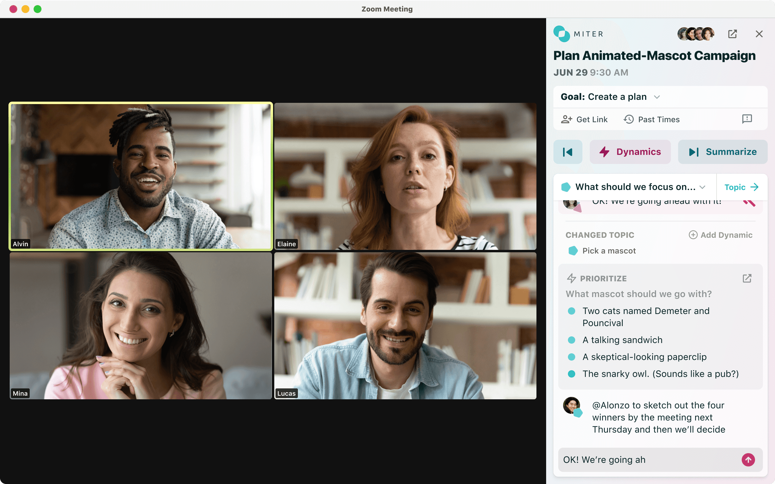
Later, I went to Harvard and got a CS degree just as the internet was taking off. And from there, I went into what we'd now call Product Design, starting with short stints in a couple of academic labs. I spent about six years doing freelance design in the Boston area, then moved to San Francisco and joined Yahoo! on the Messenger team. Over the years since, I've worked at a handful of medium and large tech companies (AOL, Google, Facebook, Heap), and founded two startups (Emu, Miter). A lot of my roles have been in design leadership but I've done product management and kept my engineering skills fresh, too.
1. Tech is big business. We have highly-specialized roles, processes, boot camps, certifications, and some truly ginormous companies. When I started, it was a lot more niche and hobbyist.
2. Design is well-respected! In my freelancer days in the early 2000s, I'd get a client saying, "Hey, we've finished our product, now can you make it usable?" And I'd have to explain that no, not really, because you can't just bolt UX on at the end...and then I'd dive in and do what I could to help them. Today, that's pretty universally known.
3. Tech is mainstream! Depending on who you talk to, tech is cool, or it's evil, or whatever, but everybody has a phone or computer, everybody emails and messages and social networks and so on, tech execs are household names, etc.
I generate new ideas by giving them space and pulling in people to help—through conversation and percolation. When I'm doing my calendar right, there's explicit time in there just to walk around and synthesize, and often that's where ideas come from.
Brainstorming sessions are a directed activity. So, first, it's a question of whether brainstorming is appropriate: is that what the project needs? Will the outputs have the chance to go on to the next phase in their lifecycle? If yes, then great: let's brainstorm. Who has to be in the room? Who else should be there to provide the right balance of personalities? How should we break the discussion down into phases? How long do we need? Can it be remote or do we need it to be in person? What are the intended outputs and next steps?
Well...I think to do that kind of forecasting can't just be an idea anymore; it has to evolve into a project with some real definition. Who is this for? What problem does it solve or what need does it address? Given the above, to what extent are we the right people to pursue it? How can we measure its success? And then, sure, with those measures in mind, how likely do we think that success is? Are there competitors or similar things out there in the market we can look to for models?
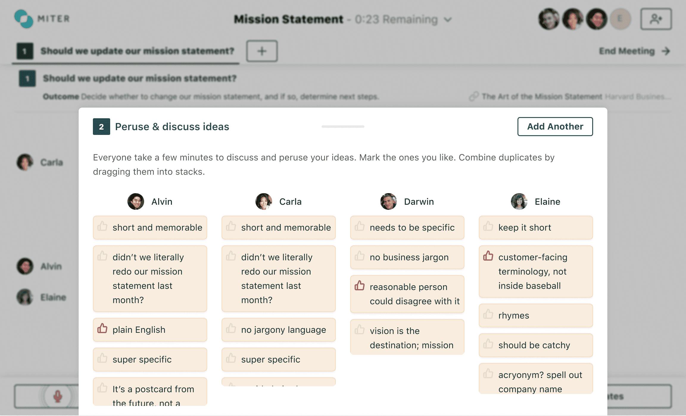
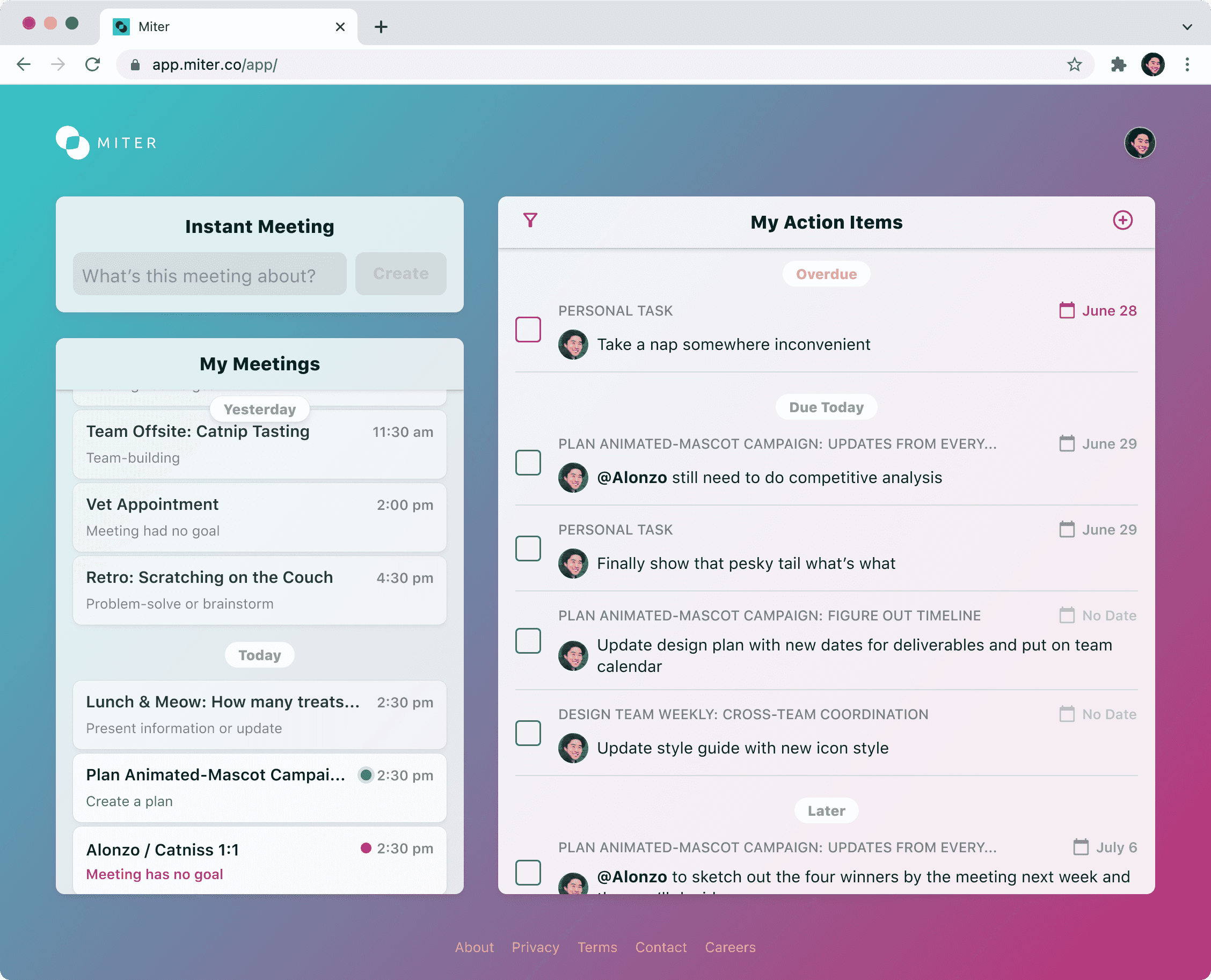
Early versions of Miter used a look & feel I called "tax form chic," which was heavily inspired by the visual style of US tax forms.
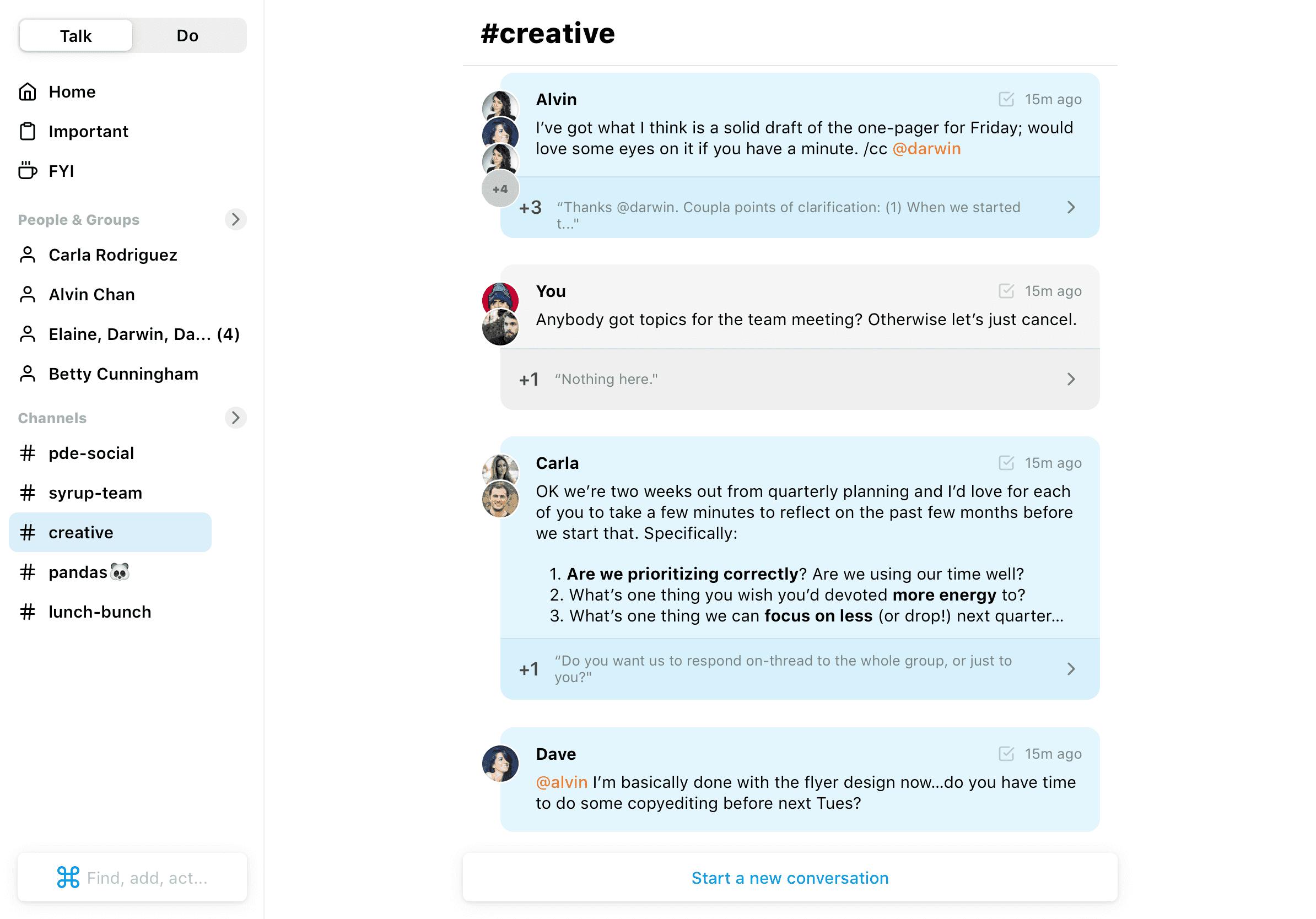
It's definitely a multi-channel / multi-level endeavor: synthesizing user/customer feedback, analyzing quantitative and qualitative data, conducting regular user tests, and doing periodic foundational research to understand our users.
Each requires a different process. For instance, to get the most value out of user feedback we need to synthesize it and ask questions to get beyond the request, and into the need. Sometimes we can do that on the spot; sometimes it fuels our other research efforts. For user testing, it's a question of doing it at the right time and making sure we've scoped our efforts to incorporate its lessons. With foundational research, it's not always tied to a specific feature or project, so we need steps to ensure its lessons are incorporated broadly: All Hands presentations, ubiquitous artifacts like personas, etc.
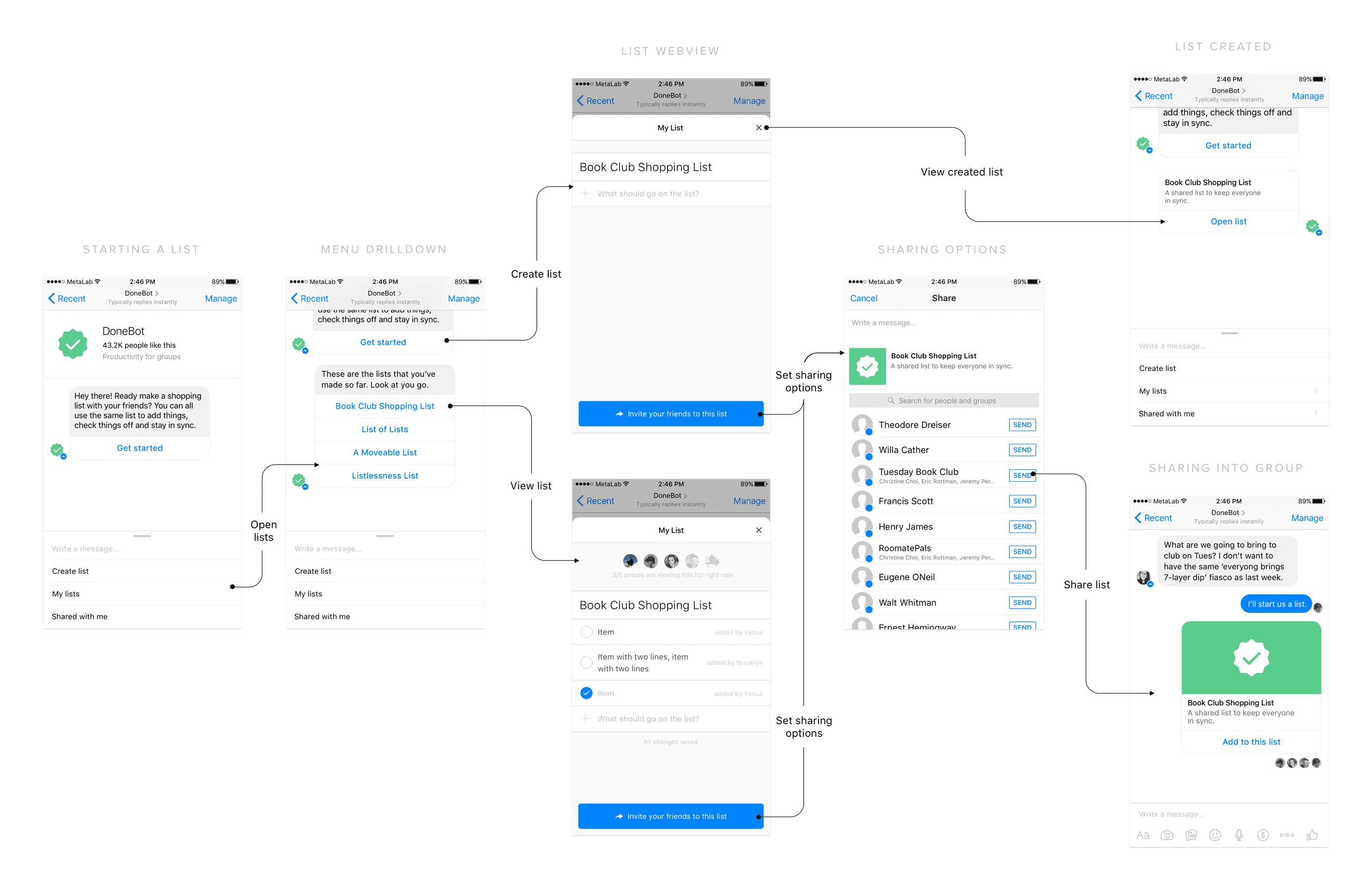
Those are the best projects! (Which means I'm doing it constantly.) My favorite, though, might be the time, early in my career, when I wanted to do a detailed 3D icon and learned Cinema 4D (and 3D modeling and rendering in general) to do it. That's a way higher learning-to-output ratio than normal, but it was fun! Far more recently, I learned Gatsby to move Miter's website off Webflow and improve its performance and flexibility.
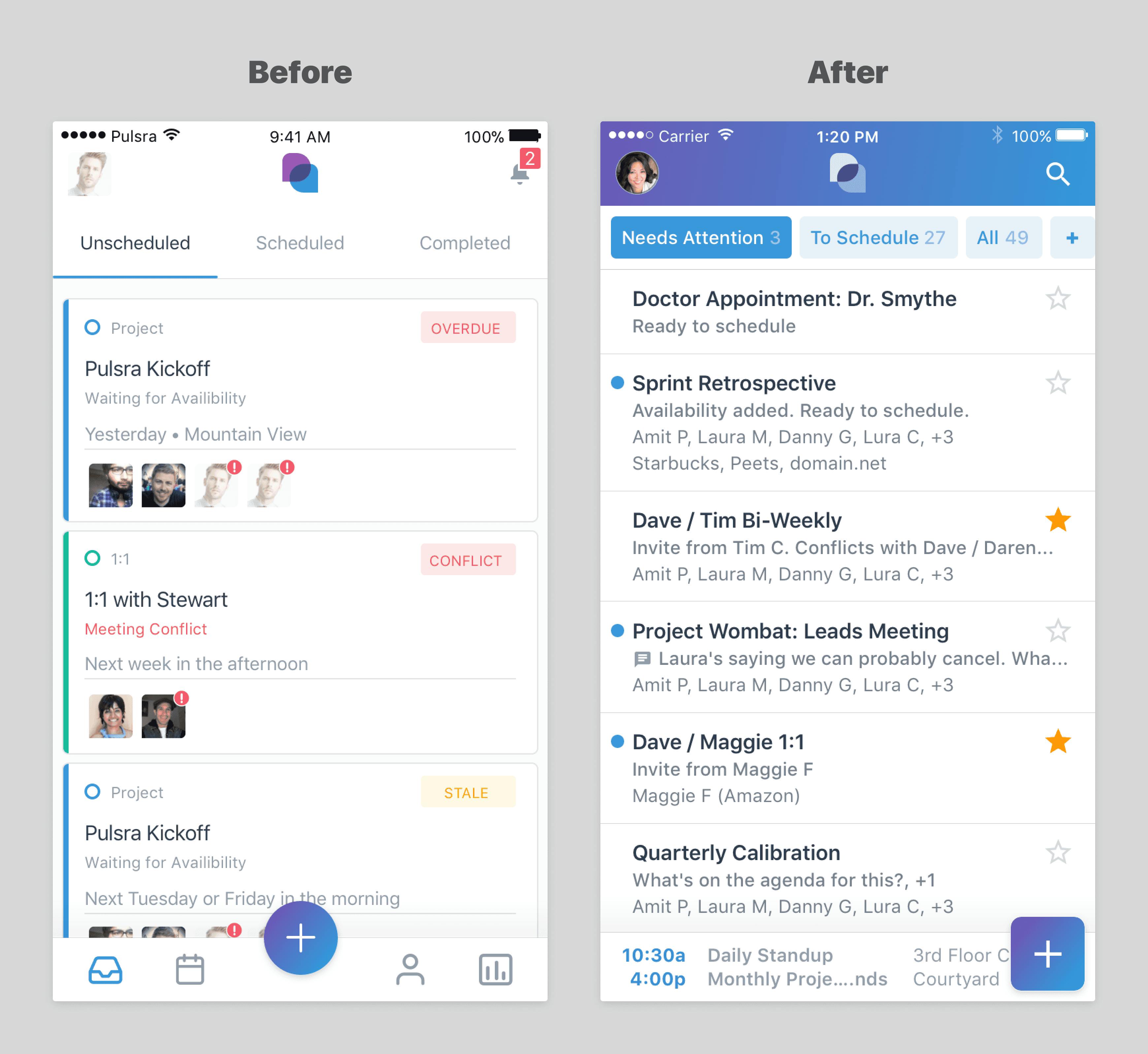
As designers, part of our job is identifying our users and segmenting them appropriately. To address inclusivity and accessibility really well, we need to think about them as dimensions within that exercise—that is, as foundational questions to answer about our designs rather than last-minute bolted-on steps. "The product is done! Now let's make it accessible and inclusive! Because those things are important this week!" does not work.
Blogs, podcasts, social media (lately Mastodon / LinkedIn), talking to people. I'm one of those rare folks still using an RSS reader too.
