Manuel Piedra
Illustrator
Concept Artist
Fine Artist

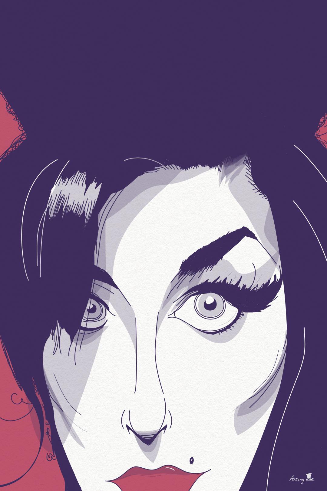
Vector Art, Portraits and Minimalism
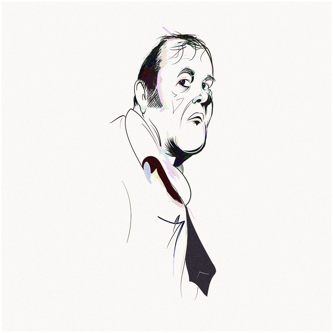
Antony Hare: I’ve been drawing for as long as I can remember. It has come in waves but, for much of my life, I’ve drawn every day. I didn’t think becoming an artist was a realistic occupation when I was growing up, so I decided to study Philosophy. I planned to become an academic with creative practice on the side.
Antony Hare: This industry, like most industries, is one based on relationships. I had worked with the Brand Director of Vanity Fair before joining the magazine. He liked my style and used me quite a few times before asking me to illustrate the portraits in the magazine. I’ve been illustrating vector art portraits since 1999 and so, by the time he came asking, my portrait work was my most confident professional offering.

Antony Hare: Vector art is distinct from other forms of digital art, in part because the working file itself is like a piece of software. The arrangement of lines, shapes, and colors is not fixed in space. The graphics within can be infinitely re-sized without degradation. These graphics are represented by mathematical equations. Some of these are called Bezier curves. There is a technical quality to adjusting these curves but, at the same time, it’s not a pixel-based form. Therefore, there is a lot of room for imperfection.
I use a Wacom tablet, the old-fashioned kind without a screen. This means I had to learn how to draw without looking at my hands. On the whole, being a vector artist demands that I don’t rely on vector art trends or take shortcuts.
“An often misunderstood and undervalued tool in the artist toolkit is subtraction.”
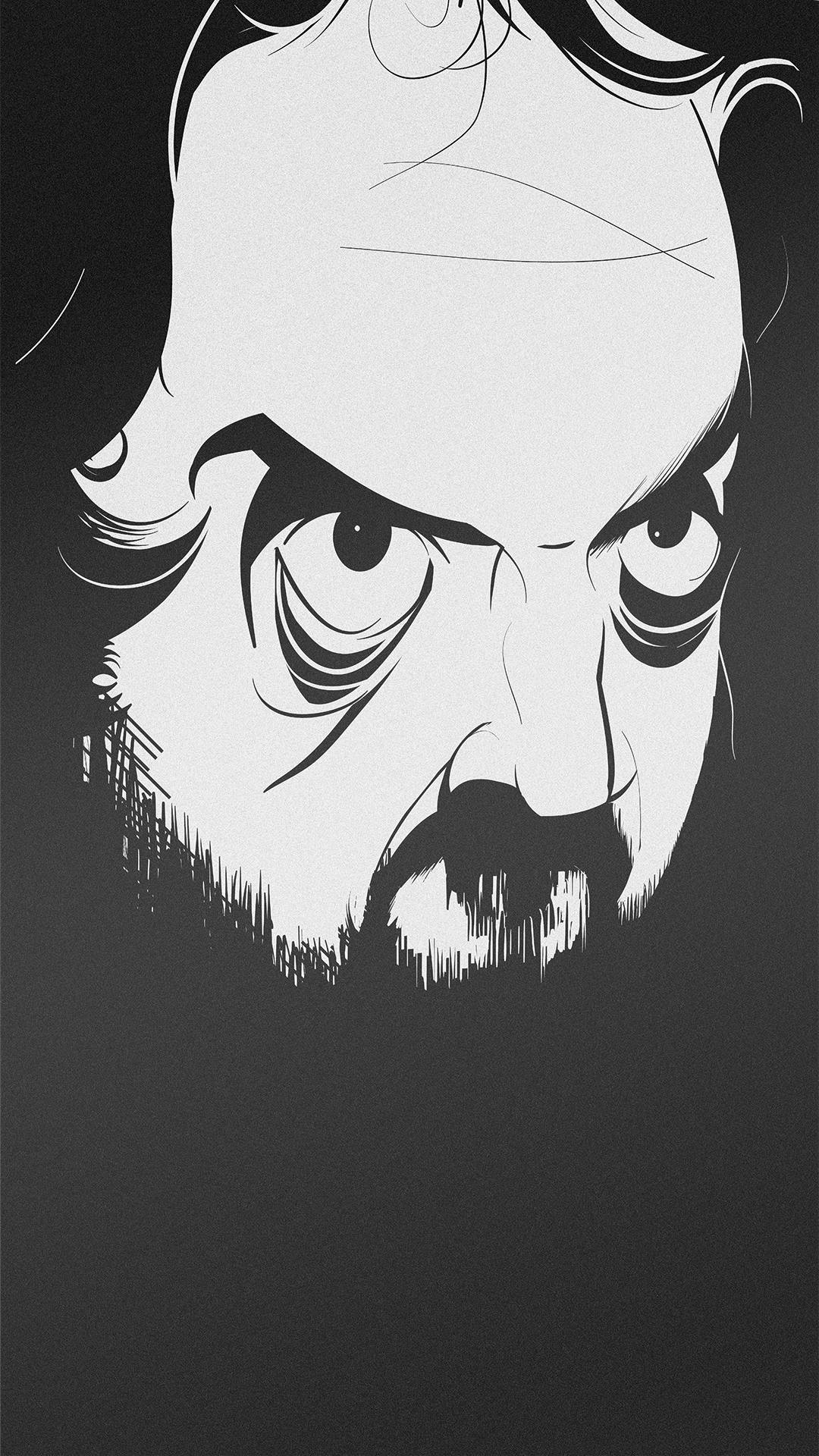
Antony Hare: An often misunderstood and undervalued tool in the artist toolkit is subtraction. Luckily for me, subtraction is costless in vector art. Big swaths of white and black convey a lot of meaning without being complex. Add to that the communicative power of the line and there’s still lots of power in minimalism.
Antony Hare: I get quite a few portrait requests. I get iconic or spot assignments that require the graphic quality of my work. I’ve also been fortunate enough to work lettering into my work.
One of my favorite assignments was from the creative arm of the talent agency, CAA. The project was with Chipotle. CAA teamed-up illustrators with writers to collaborate on cup designs. Each cup, thereby, had the written story illustrated along with a scene or scenes depicting it. I worked with Michael Lewis. You can see the result here: https://www.ahpi.ca/#e-16
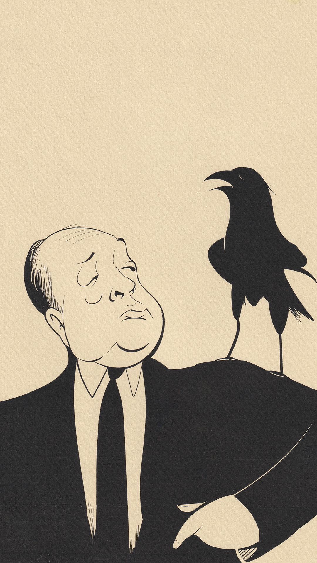
Antony: I like monochromatic work because it’s another tool in the minimalists’ toolkit. It makes value and line even more important in communicating the story of the illustration. I also like using colour but, if it doesn’t work in black & white, it won’t work with the color added.
Antony: I love living and working in London. London is a medium-sized city about 200 km west of Toronto. It is quiet enough for me to enjoy a peaceful lifestyle while, at the same time, it offers up enough natural and cultural interest to keep me inspired.
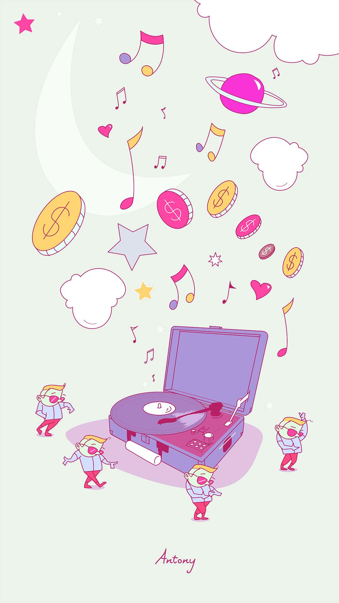
Antony Hare: I consume a lot of media – magazines, websites, movies, television, podcasts, and more. I also find inspiration in my relationships with my partner and children.
Antony Hare: No matter what else you need to do, and there’s a lot, from business and tax management to marketing and promotion, you need to keep your art practice sustainable. For many, that means drawing every day. For others, though, it means doing monthly challenges or side-projects. Whatever it is, you must at least enjoy the practice of creating if you hope to enjoy it over the long term. I will never tire of drawing and there’s great security and comfort in knowing that.
