In the world of design, presenting information effectively and clearly to an audience is paramount. This is where understanding design hierarchy becomes crucial. But what exactly is a hierarchy in design, and why is it so important? Design hierarchy is a foundational principle that guides how elements are organized within a space or layout to indicate their importance. By grasping this concept, designers can effectively guide viewer attention, ensuring that the most critical information stands out and communicates with impact.
What is Hierarchy in Design?
Design hierarchy refers to the arrangement and presentation of elements according to their importance within a composition. It is not just about establishing a visual order but also about creating a path for the viewer's eye to follow. The principle, rooted in both art and design, utilizes various design elements and principles, such as size, color, contrast, alignment, and proximity, to achieve this effect. By applying these principles strategically, designers can create a focal point and a seamless flow that enhances the understanding and communication of the intended message.
Why is the Element of Design Important?
Understanding the hierarchy in design is crucial because it determines how information is processed by the audience. In an era saturated with visual content, it is essential to capture and maintain attention efficiently. The element of design plays a pivotal role in achieving this by allowing designers to structure content in a way that communicates significance and prioritizes information. By leveraging different design elements, such as shape, line, texture, and space, designers can create an intentional flow that guides viewers naturally through the content.
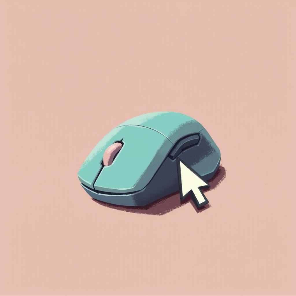
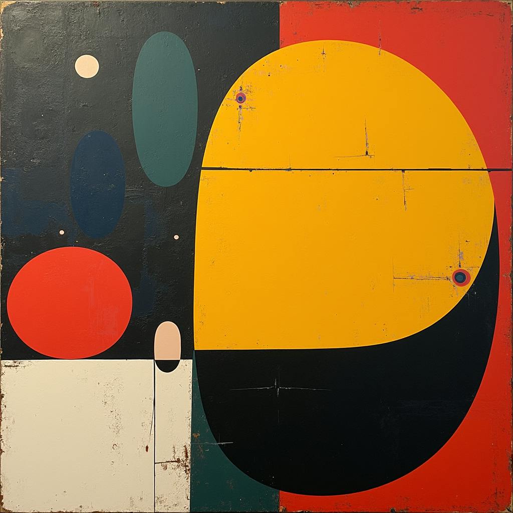
AI made with Stephanie Jagiello
Key Principles of Design Hierarchy
- Size and Scale: Larger elements naturally draw more attention. By varying size, designers can make key elements more prominent, signaling their importance and encouraging viewers to focus on them first.
- Color and Contrast: Utilizing bold colors or high-contrast elements can highlight certain areas and create emphasis. Strategic use of color and contrast helps in differentiating elements and guiding the viewer's eye to specific points of interest.
- Position and Alignment: Where an element is placed within a design can determine its perceived importance. Important elements are often aligned in positions of prominence or are placed in the center of the design.
- Repetition and Consistency: Consistency in the use of fonts, colors, and styles can create a cohesive look, while the repetition of certain elements can emphasize their importance.
- Proximity and Space: Grouping related elements together or giving them ample white space can strengthen the visual relationship and clarity, directing the viewer's attention efficiently.
Frequently Asked Questions
How does understanding design hierarchy affect user experience?
Understanding design hierarchy enhances user experience by making information easily accessible and digestible. It allows users to quickly find what they are looking for without feeling overwhelmed.
Can design hierarchy be used in web design?
Absolutely. Design hierarchy is integral to web design, helping to create intuitive navigation, highlight call-to-action buttons, and ensure content readability.
Is context important in design hierarchy?
Yes, context is crucial. The hierarchy must reflect the intent and goals of the design, as well as the expectations and needs of the audience.
How can I balance creativity while maintaining an effective design hierarchy?
Balancing creativity with hierarchy involves experimenting with different elements and principles without losing sight of the design’s purpose. Flexibility and feedback are key in achieving this balance.
understanding design hierarchy - FAQs
# Understanding Design Hierarchy: An FAQ Guide
Design hierarchy is a foundational concept in graphic design that plays a critical role in determining how viewers interact with visual content. As a Design Educator or Expert, I aim to clarify this topic through answering some frequently asked questions.
## What does 'design hierarchy' mean in graphic design?
Design hierarchy refers to the arrangement and presentation of elements within a design that guide the viewer’s attention in a specific order. It establishes a path for the eyes to follow, ensuring that the most important elements are noticed and understood first. This is achieved through variations in size, color, contrast, alignment, and other design principlesthat create focal points and flow.
## How does understanding design hierarchy help in guiding viewer's attention?
Understanding design hierarchy is crucial because it dictates the sequence in which information is processed. When hierarchy is effectively established, it prevents the viewer from feeling overwhelmed by too many stimuli at once. It directs their focus toward the most important elements first and subsequently guides them through the design in a logical and intuitive manner. By leveraging visual cues, designers can reinforce the intended message, improve information retention, and enhance overall communication effectiveness.
## What are the key elements of design hierarchy?
Several key elements contribute to establishing design hierarchy. These include:
1. Size and Scale: Larger elements naturally attract attention before smaller ones. By varying size, you can create focal points that draw the viewer's eyes to the most vital components of the design.
2. Color and Contrast: Bright or contrasting colors make elements stand out. By using a color to highlight a particular element, you can guide viewers to notice it quickly.
3. Typography: Different font sizes, weights, and styles can create a visual hierarchy within text content. Headlines are often bolder and larger, while body text is smaller and subtler.
4. Position and Alignment: Items placed strategically within the layout can create a natural flow. Centered or prominently aligned elements tend to grab more attention initially.
5. Whitespace: The use of empty space around elements can emphasize them, making certain parts of a design appear more pronounced or significant.
6. Texture and Imagery: Unique textures or compelling images can engage viewers and establish hierarchy through visual intrigue and depth.
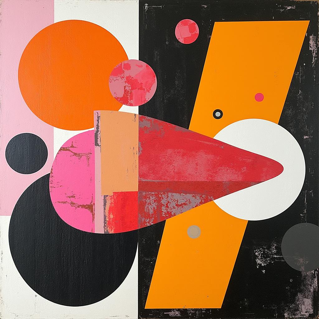
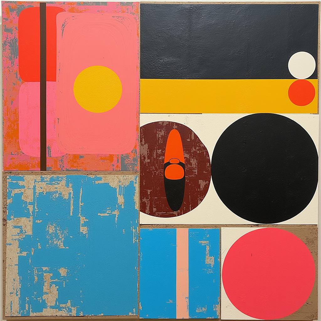
AI made with Stephanie Jagiello
## Can you provide practical examples of design hierarchy used effectively?
Certainly! Here are a few examples where design hierarchy is applied effectively:
1. Web Page Layouts: On websites, the main calls-to-action, such as "Sign Up" or "Buy Now" buttons, are often larger and more brightly colored than other elements, making them easy to spot and encouraging user interaction.
2. Magazine Covers: The headline or main cover story is typically displayed in the largest font, positioned centrally or at the top, with vibrant colors that contrast against the background, while secondary stories and text are smaller and less prominent.
3. Posters and Flyers: Event posters often feature the event name or date in bold, large text with high-contrast colors to immediately communicate critical information, followed by supporting details like location or ticket information in smaller text.
4. Infographics: These utilize size, color, and layout to guide viewers through complex information step-by-step, ensuring the most important data points stand out first and are processed efficiently.
In conclusion, understanding and applying design hierarchy is crucial in creating effective, engaging, and communicative designs. By mastering these principles, designers can control the visual dialogue and ensure their message is conveyed clearly and compellingly.
## Conclusion
Understanding design hierarchy is essential for any designer aiming to communicate effectively and guide viewer attention skillfully. By mastering design principles and elements, such as size, color, alignment, and proximity, designers can craft compositions that not only catch the eye but also communicate the intended message with clarity and impact. In today’s fast-paced digital environment, where capturing attention is more challenging than ever, the ability to implement a well-thought-out hierarchy is a valuable skill that setsgreat design apart. In essence, a thorough understanding of design hierarchy is the secret to transforming visual chaos into orderly and compelling communication.
Recommended Internal link: https://www.laetro.com/creative-skills/brand-designer