Tim Burgard
Illustrator
Concept Artist
Instructor
Storyboard Artist

Finding Inspiration for a Compelling Design Project
Susan Bolder: I didn’t know what I wanted to do, so I went to University and got a degree in Psychology, which was interesting, but I didn’t want to pursue it as a career. After I graduated, I had an odd assortment of jobs, from Bank Teller to Roller-skating waitress to Inside Sales. I eventually became an Executive Assistant to the GM at a Credit Union. Part of my job was designing newsletters and flyers in WordPerfect (yes, I’m that old!). That became my favorite part of the job, so I ended up leaving the Credit Union to work at a Printing House, which was a great education in how not to build files, and it was there that I learned QuarkXpress.
A little over a year later, I took the test at Ogilvy to work in their studio, and I passed! I worked there for about a year, and it was there that I learned to finesse files for print production.
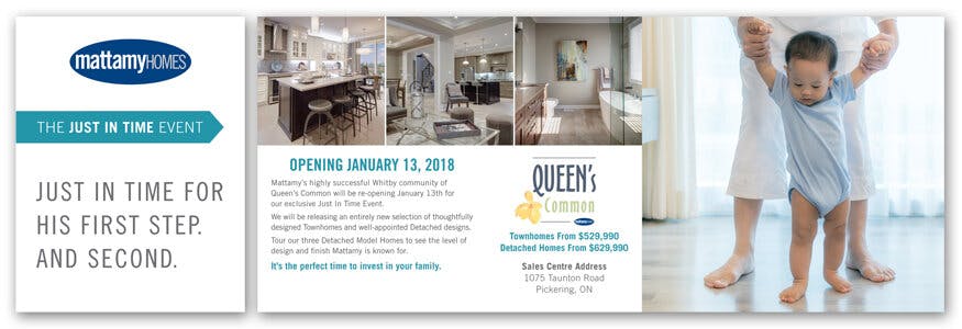
Since then, I’ve had the opportunity to work with and learn from some truly amazing Designers, and as the studio has become more of a hybrid Production/Design role, I’ve designed both print and digital for some big Canadian companies, including The Canadian Opera Company, Stratford Festival, Rogers, PanAm Games, and Mattamy Homes, to name just a few.
Susan Bolder: I started in Production. I love making files perfect. I was always the sort of person that would clean up an Excel or Word file and change the font from Courier to something nicer. Making things beautiful makes me happy.
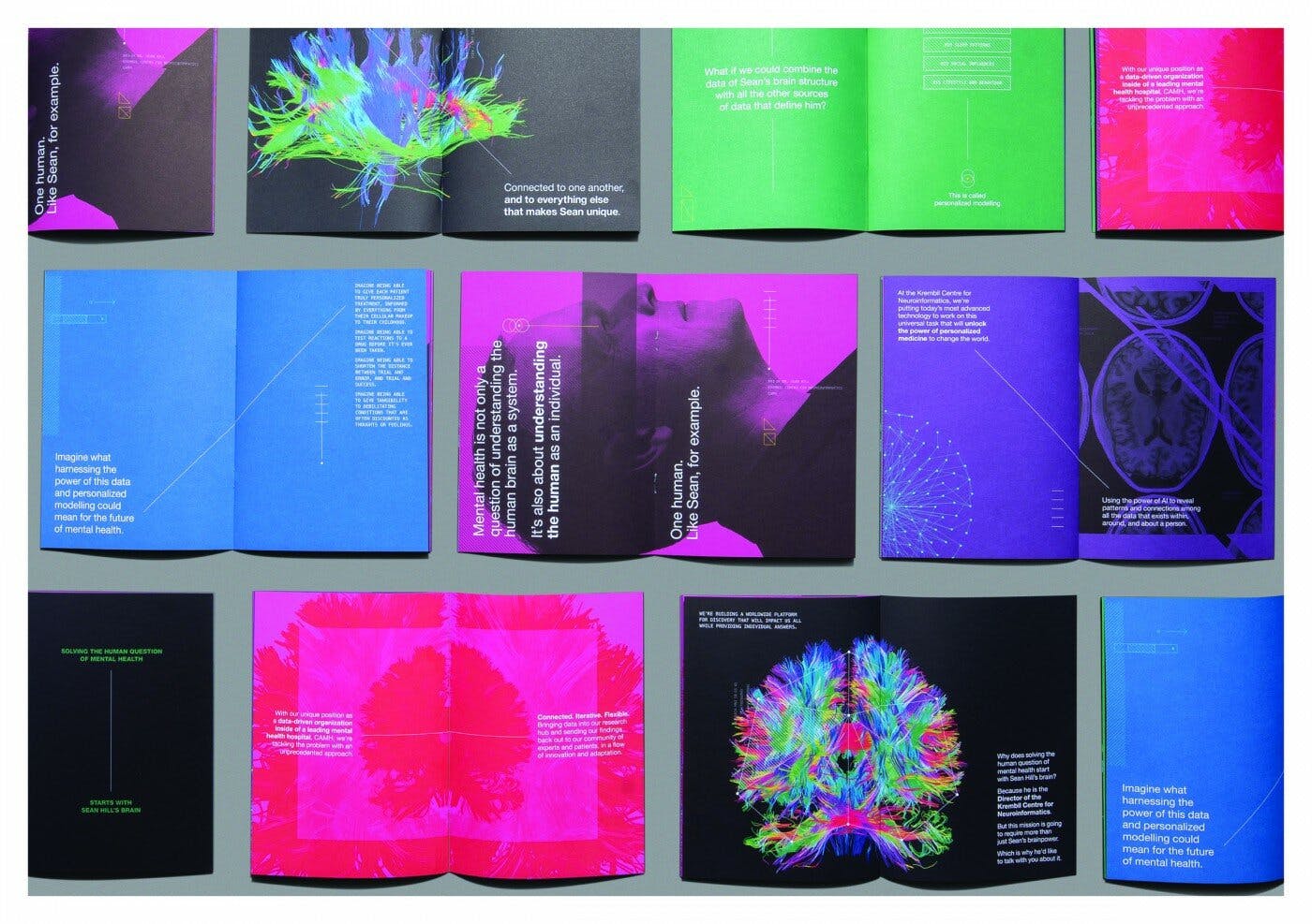
Susan Bolder: When I’m designing for someone, the first thing I want to see is their Standards Guide, if they have one, and some examples of previous work. Then we can discuss whether they want to veer away from the established standards and if so, what they like and what is their message.
Depending on what they want, I will design a few different options, each with a strong theme that is flexible enough to work for anything from a billboard to a web banner to an Annual Report. Then I like to go over the different options with the client again to discuss what works for them and what doesn’t and go from there.
“I love making files perfect. I was always the sort of person that would clean up an Excel or Word file and change the font from Courier to something nicer. Making things beautiful makes me happy.”
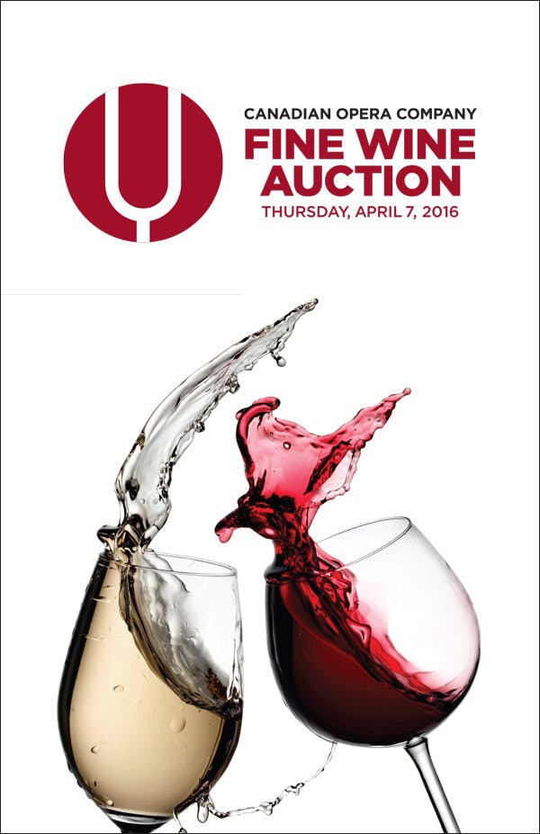
Susan Bolder: From 2010-2015, I was the Lead Designer for the Canadian Opera Company. If you went to the Toronto Four Seasons Centre for the Performing Arts during opera season, everything in the building was created by me, from the billboard on the outside of the building to the Programs to the posters on the walls.
In 2019, Toyota brought all of its work under one agency in Canada for the first time. I was the lead Studio Designer working with the Creative Director to create all Digital, Print, and In-store advertising for Toyota for all regions in a very short time frame. They were still using the same creative in 2022.

Susan Bolder: I did a series of ads for BMW MINI that were a wall of fully justified text, with 15 made-up silly quotes about the car. There were two English and two French. I had to make the type look good without any rivers or word breaks or edits to the copy.
There was one real quote that had to be in the middle and laid out so that it was perfectly centered. It was like a puzzle to put together, and it came out great. Working with type in interesting ways is my favorite thing to do.
Susan Bolder: The inspiration is often there, within the brand. What makes the company unique? What makes it interesting? Is it the message, the imagery, or something else?
Susan Bolder: I like to keep things clean and simple. The use of typography, colour, shapes, contrast, and captivating imagery keeps the focus on the message the client is trying to convey without making it so busy the consumer doesn’t know where to look, or even worse, doesn’t want to look at it. I don’t like anything that’s over-designed, as it takes away from the intended message. Form follows function, essentially.


